Capital Allocation Line (CAL)
How slicing your cash between the spicy risky stuff and the boring risk-free stuff moves your expected return and volatility — that's the Capital Allocation Line.
This is the last bit of Chapter 5 — really more of a bridge into Chapter 6 than its own thing.
Skipping the intro. Let’s go.
Risky portfolio vs. risk-free portfolio
When we build a portfolio, the most important question is:
“How much do I throw at the spicy, risky stuff, and how much do I park in the boring, stable stuff?”
“Where do I draw that line?”
We need to answer those question marks. Basically — I want to talk about asset allocation, and dig in a little.
OK so. Say we’ve got $300,000 sitting there, and we want to figure out how to slice it up.
There’s an important assumption coming, but first let me lay down some notation.
The chunk in risky assets — call it P.
The chunk in risk-free assets — call it F.
You can think of P as “portfolio” and F as “free.” Easy.
So the game now is: out of this $300,000, how much goes in P and how much goes in F?
Here’s the important assumption:
When we shift money from the risky asset (P) over to the risk-free asset (F), we assume the relative weights of the various securities inside P don’t change!!!!
Like — say originally the $300,000 is split as:
- Risk-free F: $90,000
- Risky P: $210,000
So a 3:7 ratio. And inside that risky P, suppose the bonds-to-stocks ratio is, say, 54:46.
If we want to change the F:P split,
even if we yank some of that $210,000 out of P and dump it into F,
the bonds-to-stocks ratio of what’s left in P is still 54:46.
OK OK????
Why does this matter? Because if we shuffle money this way,
we haven’t messed with the internal weights of the risky portfolio,
so the return of P itself doesn’t change when we reallocate —
only the expected return of the overall combined portfolio does.
Feel it?
Why this assumption? It’s so we can ignore return swings caused by rebalancing inside the risky bucket. The whole focus right now is: how does the return change as we slide the dial between F and P?
Cool. Sorted.
Moving on.
So our ultimate goal: depending on how we allocate, we want to quantify what happens to volatility, and what happens to expected return $E(r)$.
In other words — we want to draw this on a graph:
That’s the move.
Here, $E(r)$ is the expected return of the mixed portfolio, and $\sigma$ is the standard deviation of the mixed portfolio.
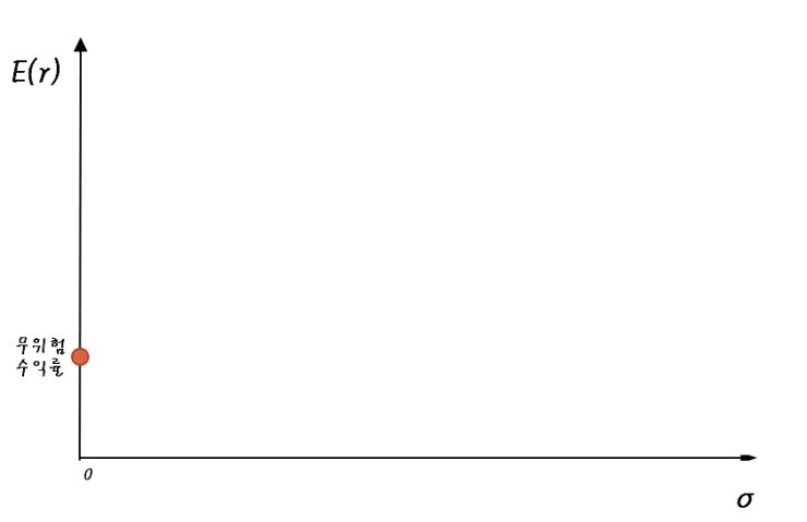
OK, let’s start with extreme cases.
Case one: F:P = 100:0!
Everything into the risk-free asset. The return is just the “risk-free rate”
$$r_f$$That’s it.
And the volatility for that return???
Think about it.
Volatility on the risk-free rate?
“Risk-free” means there’s no risk, which means no volatility, right???!
If we bother sketching the probability density function, it’d look like this (a Dirac delta, basically…..)
— actually, that’s not really true. Why it’s not true gets revealed in Chapter 6… heh heh
So plotting what we just described as a single point on our axes:
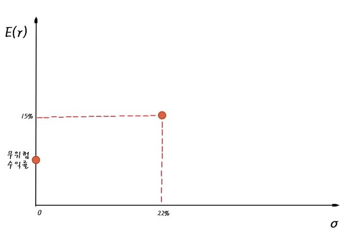
Now the other extreme.
For this we’ll need actual numbers. Let’s just borrow the textbook’s:
If we dump everything into the risky portfolio P,
then the mixed portfolio = P,
so they have exactly the same characteristics, obviously?!?!?!!!
Plot that point on the same graph and it lands right here:
And now, slowly slowly slowly,
let’s slide the F:P ratio
from 0:100 all the way over to 100:0.
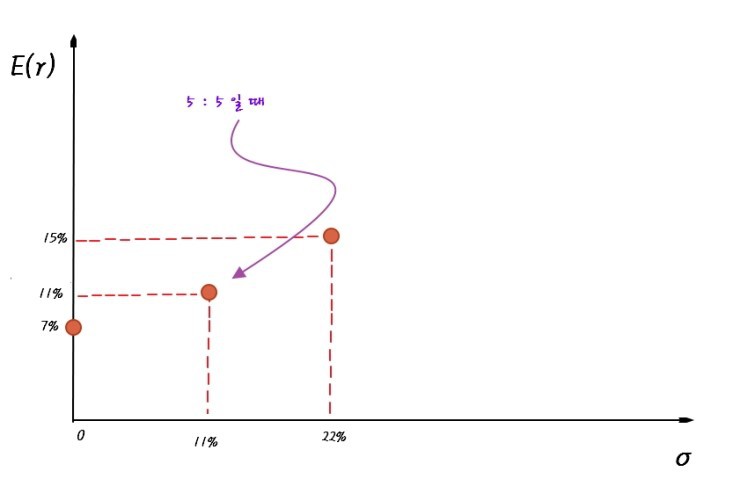
Let’s keep it simple and look at the 50:50 case.
This is where that important assumption from earlier flexes:
--------------------------------
When we shift assets from risky (P) to risk-free (F),
we assume the relative weights of the securities inside the risky portfolio don’t change!!!!!!
-----------------------------------------
That assumption is doing serious heavy lifting, because now:
$E(r) = 0.5 \cdot 7\% + 0.5 \cdot 15\% = 11\%$, and
the volatility of the mixed portfolio is just $\sigma = 0.5 \cdot \sigma_p$.
That is:
And now intuitively — if we let the ratio slide continuously from 0:100 all the way to 100:0, and plot each point one by one:
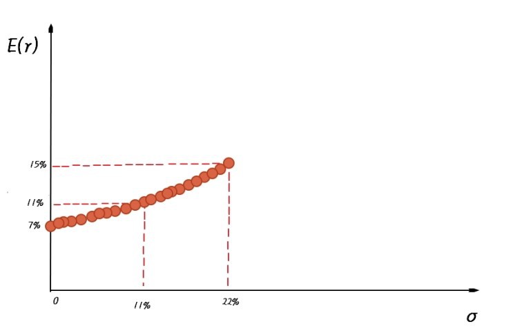
And connect all those points into one line:
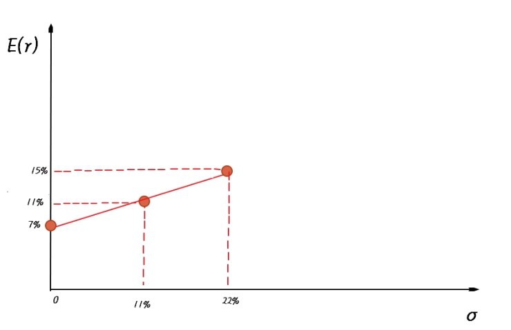
Boom. That’s the shape.
And if we read the slope of this line:

What’s the slope, really?
It’s the Sharpe measure, isn’t it?!?!?!
So the slope of this graph is the Sharpe measure!!!!!
Took us a minute to get here, but now — given just a couple of values — we can draw this line instantly. Because:
- y-intercept: the risk-free rate
- slope: S (the Sharpe measure)
And this linear function we just drew — what do we call it?
CAL — the capital allocation line.
Right now the CAL feels kinda toothless, and you’re probably wondering, why are we even doing this?!?
I went into detail because we’re going to need it in Chapter 6.
Done! haha
Originally written in Korean on my Naver blog (2016-04). Translated to English for gdpark.blog.