Behavioral Finance
Behavioral finance argues human irrationality — forecast errors, overconfidence, conservatism bias — actually moves markets in ways the efficient market hypothesis can't explain.
Behavioral finance:
A model of financial markets that emphasizes the potential significance of psychological factors influencing investor behavior.
Enter: the behavioral finance crowd!!!
“Hey!!! Isn’t ’every human being is a perfectly rational decision-maker’ kind of a brutal assumption?!! And what about all these anomalies that keep showing up???”
What these folks are hammering on is basically: “this thing called ‘human beings’ actually changes the outcome.”
So what they really wanted to do was shove human irrationality (irrationality) into the economic models.
OK so how do you phrase ‘humans are irrational’ in a way that sounds, you know, scientific:
Humans can’t always process information like a supercomputer. (i.e., they can’t accurately estimate the probability distribution of returns.)
Therefore, their choices aren’t always consistent — and the decision they end up making isn’t the optimal one. It’s a second-best, falling short of the real best.
Now, you might push back: “OK but there are arbitrageurs — those guys are basically supercomputers. And whenever ‘just regular humans’ mess up, the arbitrageurs pounce, profit, and drag the inefficiently-priced thing back to its efficient price. Right?”
But!
Behavioral finance people say: nope. Even arbitrageurs can’t yank a security’s price all the way to its intrinsic value.
In other words, they are mercilessly trampling all over the efficient market hypothesis.
OK, let’s hear what bits of psychology the behavioral finance crowd actually pays attention to.
1. Forecast errors:
When people make decisions, they put way more weight on ‘recent experience’ than on their prior belief.
And the degree to which that prior belief refuses to die… is enormous.
Apparently it’s pretty common for the prior to survive even after the person gets badly burned.
2. Overconfidence
People underestimate the uncertainty in their own beliefs and predictions. At the same time, they overestimate their own abilities — and from there, the irrationality just spirals.
Evidence:
Index investing (indexing), a flavor of passive management, has been growing steadily. But even with all that growth, those accounts still make up less than 10% of the total.
So can we conclude most people are overconfident in their own skills and doing active management?
That alone probably isn’t enough proof. But combined with the other quirks below, it stacks up.
3. Conservatism (conservative bias):
Investors take forever to update their beliefs in response to new evidence.
Feels kind of like #1, but stay with me —
The point here is that humans (ningens) are unbelievably conservative. New info doesn’t get baked into prices fast and snappy. It seeps in slowly. Gradually.
(This is the human trait that creates the “price momentum” we talked about in the previous post.)
4. Representativeness:
The tendency to completely ignore sample size.
The info humans (ningens) pulled from a sample… even though it came from a sample, they think it has some kind of “representativeness” — as if it had been drawn from the whole population.
They infer patterns way too fast from a tiny sample, and then extrapolate that pattern way too far into the future.
5. Framing:
Decisions flip depending on how the alternatives are ordered — gains relative to a minimum, losses relative to a maximum, etc.
Even if we grant that humans can compute like a supercomputer, the point is: the animal called ‘human being’ doesn’t actually pick the rational answer.
Why? Because, apparently, people are ‘risk-averse over gains’ and ‘risk-seeking over losses.’
Like:
“Sir!! There’s a 70% chance you lose x with this!!!” and the guy goes,
“I’m betting on the 30% (annoyed face). LET’S GO!!!” — that kind of energy?? lol
Somehow lol this hits a little too close to home lol
6. Mental accounting:
A special case where people compartmentalize certain decisions.
When people make decisions, they split themselves into separate “accounts” and reason inside each one in isolation.
So a person opens two accounts and, in their head, goes:
‘Ohh~ this one is the investment account, and this one is my buying-a-house account ^^’
They mentally wall them off.
Then for the first one they go full cowboy — big risks, big swings — and for the second they crank the conservatism to eleven: “NO RISK. I just need to safely buy a house!!!”
Totally different vibes for each.
Which means: no consistency,,,,
When you zoom out, it’s all just one total portfolio anyway….
This mental accounting thing is supposedly what explains the momentum effect.
If you watch people gambling at a casino — after winning some money, when they place the next bet, they don’t think they’re betting their own money. They’re betting ‘money won from the casino.’ That’s the house money effect.
Same exact thing in the stock market: an investor who’s been riding a sustained rally looks at the gains piled up in their account and thinks of them not as their own money but as ‘funds from a capital gains account,’ so they pile on even more risk….
That’s how momentum gets generated, supposedly.
7. Regret avoidance:
When a decision that bucks convention turns out wrong, people beat themselves up way harder over it. So to minimize regret, they just go with convention.
In other words: when a choice produces a bad outcome, the further it strayed from convention, the more brutally they regret it.
Losses on blue-chip stocks, on the other hand? Easy to write off as bad luck, apparently.
8. Prospect theory:
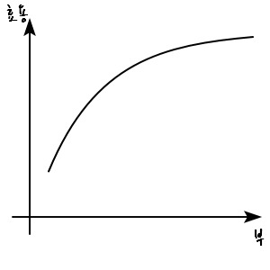
The idea is that an investor’s utility is determined by gains and losses — not by the level of wealth.
In traditional economic theory, the utility function gives us the foundational principle, “the law of diminishing marginal utility,” and produces this graph:
But the behavioral finance folks say: nah.
Unlike traditional utility theory, they say utility doesn’t depend on the level of wealth — it depends on “changes from your current wealth.” And they hand us this new graph:
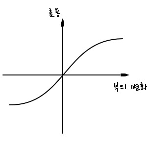
What this graph is saying is — traditional utility theory basically claims that as you get richer, you avoid risk less. The new graph doesn’t say that.
And this new graph is supposedly able to explain why historical risk premiums have stayed stubbornly high.
The behavioral finance crew’s psychological re-read of financial markets is… not fully satisfying, though.
OK, fine, errors can creep into prices — got it. But can you actually make money exploiting those errors or not?
You said even professional arbitrageurs are humans-after-all, so it’s hard to find cracks in those errors????
Apparently they don’t really answer questions like that.
So from the perspective of an old-school economist:
“What is this!!!! If I felt like it I could shove the reasons behind any anomaly I’m looking at into a behavioral framework too!!!”
That’s roughly the reaction. And one economist apparently went:
“I figured out what you guys do. Every single time, it goes:”
“Abnormal returns get corrected over the long term → consistent with overreaction.”
“Abnormal returns persist for a long time → consistent with underreaction.”
…what.
Anyway —
it’s still way too early to declare behavioral analysis correct across the board.
However.
Technical analysis…
We talked about this earlier, right?! The whole ‘stare at past data, find patterns’ thing?!
These guys haven’t given up. Still trying to find patterns.
The logic: you can’t ignore the “disposition effect”!
The disposition effect is the tendency for investors who are sitting on losses to refuse to cut and walk away.
I mean — they basically just believe in ‘price momentum’, right???
Since (they figure) there must be momentum in stock prices, they try to quantify the momentum and predict the ’trend’ to some extent.
The classic version of this effort is Dow Theory.
Dow Theory:
The primary trend is the long-term movement of prices, lasting from several months to several years.
The intermediate trend comes from short-term deviations of prices away from the primary trend. These deviations get corrected as prices snap back to their trend value.
The minor trend is daily noise. Doesn’t matter.
So: looking at price records, you’d interpret them like this.
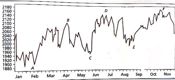
When you see this, boom~~
Yo-ho~~, they say.
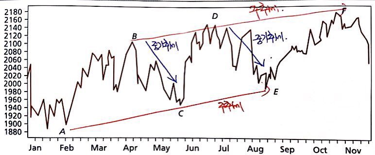
Still — my gut isn’t fully at ease.
Couldn’t a “trend” like this only ever be discoverable after everything has already happened~~~?
That uneasy little voice keeps popping up in my head…..
OK OK OK OK,
so a few more tools get introduced for spotting trends.
What else lets you look at a trend?
1. Moving average:
Looking at how the average of stock prices moves. There are lots of flavors, but apparently the 200-day average and the 53-week average are the two most commonly used.
Why those two specifically? Apparently not undergrad-level material.
How is the moving average graph built?
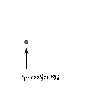
If the first point is the average of day 1 through day 200, then the very next plotted point drops day 1 and adds day 201 to compute its average,
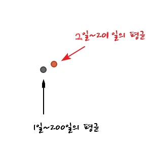
and from there points get plotted dot-dot-dot-dot-dot-dot~~ one after another!
As an example, here’s a moving average chart for Intel — looks like this, apparently:
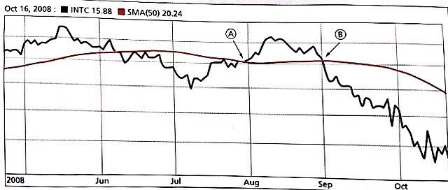
OK, so how do you read the ’trend’ off this chart?
A point like A — where the current stock price breaks up through the moving average — gets read as an “upward trend.” Conversely, a point like B — where the price breaks down through the average — gets read as a “downward trend.” Apparently.
Anyway, so… that’s one way to interpret trends… heh
But this is only for one individual stock. Betting on just that? Feels a little thin, right????
So investors apparently refer to a number called “market breadth” — published daily in the Wall Street Journal.
Market breadth is an indicator showing how broadly the movement in a market index is reflected in the price movements of all the stocks in the market. The actual indicator used is —
“number of advancing issues & number of declining issues,” apparently. (Cumulative — including the running total up to the previous day.)
What gets published daily in the WSJ supposedly looks like this:
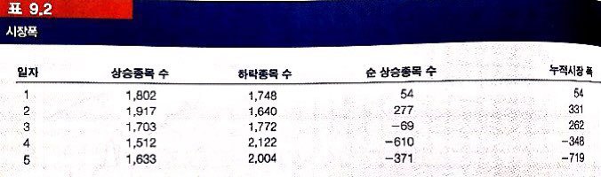
Looking at this, you can get a rough big-picture sense of how much is going up vs. down.
But this still feels a little thin too.
Yeah yeah yeah yeah yeah yeah —
there’s more, more more more more more more.
Another thing you can lean on is something called “relative strength.”
What’s this?
It’s an indicator of whether performance is higher or lower compared to the “industry” (the bigger pool).
So what that means: say we’re considering an investment in Hyundai Motor.
Then relative strength looks like this:

No matter how much Hyundai Motor’s index is growing — if the auto industry index is growing relatively more, you can tell Hyundai Motor isn’t actually crushing it from the perspective of the auto industry.
The opposite case: Hyundai Motor’s index is growing while the auto industry index is barely budging. Then we’d say Hyundai Motor is leading the auto industry’s performance. heh heh heh
Or,

from a higher-level view like this too — you can see at a glance whether the auto industry as a whole is currently ripping or only mildly rising.
The stuff above is for analyzing the market. But there are also some indicators for analyzing trends not in the market but in people.
(These get called sentiment indicators, apparently.)
First one:
Trin statistic
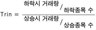
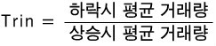
Definition’s above. Looking carefully at the numerator and denominator, I think it can be said like this..
Looking at this definition, it seems to be telling us how much humans (ningens) are selling when prices are falling, and how much they’re buying when prices are rising — that kind of thing.
Hmm… so —
it’s not like people automatically sell just because prices are dropping, right??!?!
If we look at how much humans (ningens) sell when prices are falling, what do we actually learn??!?!?
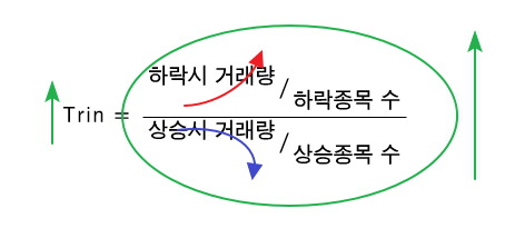
Probably: “how much humans (ningens) trust the market.”
Because I trust the market!!!
I think this dip is temporary / the rally will keep going!!! heh heh heh
In that situation:
Trin value goes down.
So: trusting the market → trin ↓
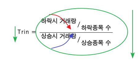
I don’t trust the market.
The drop’ll keep going / the rally is temporary.
So: not trusting the market → trin ↑
I think that’s the summary.
Not done yet.
There’s more.
Short interest:
The total number of shares currently sold short in the market.
When do humans (ningens) short something?!?!?!
To profit from a short, the stock price has to fall.
So: a large short interest reads as “humans (ningens) are expecting prices to fall,” and a small short interest reads as “humans (ningens) are expecting prices to rise.”
Still not done. More.
Put/call ratio

This options ratio also lets us roughly gauge how humans (ningens) are expecting things — same flavor as short interest above.
A call option is the purchase of “the right to buy at the exercise price (exercise price),” so buying a call is for profiting when prices have risen.
Or — preparing for a situation where prices have risen, right??!?!
A put option is the opposite — purchase of “the right to sell at the exercise price.” If you hold one, you profit when prices have fallen.
In other words: more puts means people expect prices to drop. Or it’s hedging for a drop.
But — not everyone with options is necessarily speculating for profit.
Some people are using them defensively.
So: even if no one were strongly expecting prices to go up or down, there’d still be some baseline put/call ratio.
That baseline is apparently around 65%.
So whether the ratio is above or below 65%, you can roughly gauge how humans (ningens) are expecting things, apparently….!!
Originally written in Korean on my Naver blog (2016-05). Translated to English for gdpark.blog.