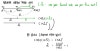
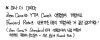
Yield Curve
Finally cracking open the yield curve — spot rates, zero coupon bonds, and why discounting everything at one single yield is kinda ridiculous.
Alright, the time has finally come — we’re talking about the Yield Curve!!!
(And since we already beat geometric mean returns into submission earlier, this is gonna be a piece of cake.)
The Yield Curve is a huge deal!
Not only because this stuff can absolutely wreck you in Level 2,
but like — we’re not studying just to get the little piece of paper, right!??!? This matters in finance for real. Gotta actually know it.
There are 4 things introduced here, but 2 of them are basically the same thing,
so at the end of the day we only need to nail down exactly 3. :-)
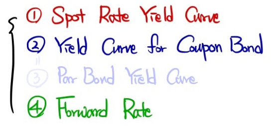
Exactly like that. I’m gonna hammer through these 3 one by one.
Aaaaaaaaaa — there’s actually something I promised I’d cover back in the Yield Curve section and just… blew right past it. hehhh.
Let me back up and do Spot Rates real quick before moving on.
What’s a Spot Rate? It’s “the yield of a Zero Coupon Bond.”
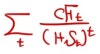
Hmm…. So this formula. The one we used without blinking back when we were doing bond Valuation —
(I mean, you weren’t really using it without blinking, of course ^^)

— this thing prices a bond while quietly carrying a massive assumption tucked inside it….
The assumption that when we discount everything back to present value, we pull it all back using the same yield for every single period……..
Which is, I mean. Ridiculous, right……..
Because the second you walk into the bond market and go to buy a 1-year, 2-year, 10-year, 30-year…. bond, the yield is fundamentally different depending on which one you pick up.
“You want me to park my money for THIRTY YEARS?!?!?!?!?!??!?!?!? Then you’d better pay me more!!!!!!”
Unless the economy is in some super dark place, most people are gonna say this.
(Flip side — if investors think things are about to go south, you get: “Yo!!! I’ll park for 30 years!!! I’ll take it right now even at 10%!!”
“The guy next to you is quoting 10%? I’ll take 9%, sell it to me!!” — and that’s how the long-short spread ends up inverted. heh.)
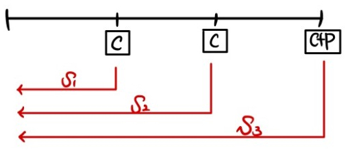
Anyway — look at government bonds that are Zero Coupon Bonds, and because the yield depends on whether the maturity is short or long,
zero coupon bonds at different maturities each have their own Spot Rates — $s_1, s_2, s_3$, like that.
And these are basically the true risk-free rate, calibrated to each specific number of years.
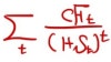
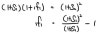
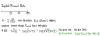
So the true Value of a Bond is not this
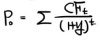
but this
right? (Bond price with no arbitrage opportunity.)
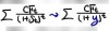
And so
YTM is basically back-solved out of this thing. :-)
(Whatever $y_n$ you crank out is gonna be smaller than $s_n$. Because YTM carries this baked-in assumption that every coupon payment coming in along the way also gets reinvested at YTM —
so even a YTM smaller than $s_n$ ends up compounding out to match the $s_n$ return in the end. ^^)
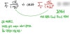
So the true Value of a Bond needs to be discounted like this:
For the Cash Flow coming in 1 year, we pull it back using the 1-year rate on the on-the-run issue (benchmark).
For the Cash Flow coming in 2 years, we pull it back using the 2-year rate on the on-the-run issue (benchmark).
For the Cash Flow coming in 3 years, we pull it back using the 3-year rate on the on-the-run issue (benchmark). Right?!?!?!?!?!?
Every $s_n$ here is for a zero coupon bond,
and they’re called spot rates.
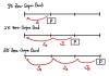
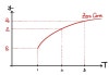
Plot these on $T$(maturity) vs. Yield axes and
you get the Spot Rate Yield Curve (a.k.a. the Zero Curve).
Now you get why it’s named that. heh heh heh.
But — there’s also the YTM of a 1-year Coupon Bond ($y_1$), the YTM of a 2-year ($y_2$), … and so on.
(Note: the YTM of a 1-year bond is the same as $s_1$.)
Plotting those $y_n$’s gives you what’s called the Coupon Bond Yield Curve (a.k.a. the YTM curve).
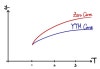
But wait — why does the YTM Curve sit below the Zero Curve????
If the bond is priced correctly,
it trades at this price. But because we forcibly calculate YTM by smashing everything down to the same $y$, what happens is
YTM ends up being a kind of average across $s_1$ through $s_3$,
and if $s_1 < s_2 < s_3$, then you end up with $y_3 < s_3$ — so yeah, it sits below!
(And obviously — if the Spot Curve is downward sloping, the YTM curve sits above the Spot Curve!)
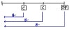
OK, last one — there’s also this thing called the Forward Rate.
What is this…. it’s the forward rate….
Instead of “rate for 1 year from now, 2 years from now, … $n$ years from now” —
it’s the rate for "$n$ years, starting $m$ years from now."
It’s a derivative! heh.
The theoretical forward rate works like this:
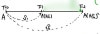
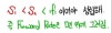
In this setup — what does the rate for “1 year, starting 1 year from now” have to be so that there’s no arbitrage opportunity?
Pin it there and no arbitrage shows up.
That forward rate is called the Implied Forward Rate.
Because earning $s_1$ for 1 year, and then the rate for 1 year starting 1 year from now,
has to equal earning $s_2$ for 2 years — otherwise you’ve got free money — that’s how the forward rate falls out theoretically.
Honestly at this point, “bro, I can calculate the rate for $n$ years starting $m$ years from now too!”
is not a bluff. You really can.
In fact — if someone hands you a whole pile of Spot Rates,
you can crank out every single Implied Forward Rate hidden inside them, one after another, just rolling through.
Now — why would someone want to lock in the rate for 1 year starting 1 year from now, i.e. trade that $_1f_1$ forward? What’s their angle?
Because they think that when that year actually arrives, the $s_1$ at that moment is gonna be higher than $_1f_1$.
i.e. they think rates are going up, so they want to lock in now.
Which means — forward rates already have people’s view of the future economy baked into them.
And since being handed Spot Rates means you can compute every Implied Forward Rate,
Spot Rates themselves actually carry a ton of information inside them already!!!!?!?!!??!!!!
That’s how important an indicator they are.
Now now now now now now now now —
That forward rate we just cranked out uses the geometric mean principle, right?
Since $s_2$ is in a geometric-mean relationship with $s_1$ and $_1f_1$,
and if you stare at this formula for a sec, since $s_2$ is already bigger than $s_1$,
$_1f_1$ has to be bigger than both of them for the thing to balance out,
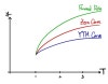
and what I’m trying to say is — the Forward Rate ends up drawing the highest curve on the plot. heh heh heh heh.
Easy, right!!??!?!?
Oh — and one more thing.
So $s_2$, $s_3$, $y_4$ — whatever — these are all average concepts.
“Roughly, what % return per year does this give on average?” — that’s what YTM or Spot Rate is.
But the Forward Rate — it’s not an average-per-unit-period kind of thing.
It’s just the total return over that period, as a lump.
So kill the “per-period return” intuition for forward rates!!!!!!
I’ve already covered all of that stuff before,
so I’m just skipping straight past this one!!!!! heh.
What comes next is Yield Spread,
and if I try to fit all of that in here too, it’s gonna be bad for my mental health.
So Spread is getting its own post.
It gets a little confusing, in spots……
I’ll suit up and come back for Spread!!!
Alright everyone — Merry Christmas!!!! heh.
Originally written in Korean on my Naver blog (2021-12). Translated to English for gdpark.blog.