IS Curve and LM Curve
Finally deriving the IS and LM curves for real — dropping the constant-investment assumption and sketching out equilibrium in both the goods and financial markets!
Now let me actually derive the IS curve and the LM curve!!!!
Last time we walked through the IS relationship and the LM relationship.
The IS relationship was about the goods market. The LM relationship was about the financial market.
I didn’t really hammer this earlier, but I want to hammer it now.
The IS relationship and the LM relationship —
these are what tell us the equilibrium in the goods market and the equilibrium in the financial market, respectively!!!!!
Got it? OK then.
Now let’s actually draw the curves.
Back when we were chewing on the IS relationship,
we set NX = 0. Closed economy assumption.
And we also assumed that I (investment) was constant.
That second assumption — I’m dropping it now.
This is something I’m telling you for the first time.
I actually depends on Y and i.
When Y goes up, sales go up, and firms turn around and invest more to chase that profit.
When i goes up, loan rates are high, so investment gets pushed off to later. Higher chance I gets deferred.
So what I’m doing is: that I we used to treat as a constant — let’s swap it out.
Like that.
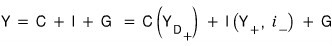
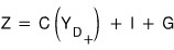
I threw the consumption equation in there too.
OK so first,
we need to chew on this before moving on.
(Because from here on, everything is graphical interpretation.)
(We said we were drawing Curves, right?^^)
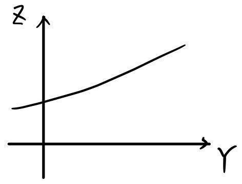
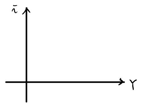
How did we draw this thing? Like the picture above.
That was because we’d assumed disposable income and consumption have a first-order linear relationship.
But now the form of the equation has changed.

We don’t actually know if it’s a first-order linear thing or not.
Drawing it precisely? Impossible. But — let me think about it like this.
Just intuitively.
When Y is small, even if Y goes up a bit, Z barely budges. Tiiiiny bump.
But when Y is big, even a small uptick in Y makes Z jump quite a bit more than it did when Y was small.
If I just say “the slope keeps getting bigger,” that’s the whole thing in one phrase —
but I was just walking through why the slope keeps getting bigger!!!
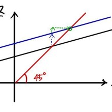
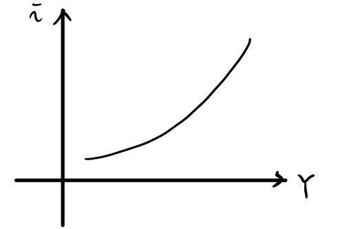
OK so, if we sketch the ‘rough shape’ like that, and slap Z=Y on top of it, and find the intersection — that intersection is the ’equilibrium’ — it’ll look like this:

Like that. (If this isn’t clicking, go read post #1. http://gdpresent.blog.me/220589182387 )
Goods market, Short-Term Model [My Study of Macroeconomics #1…]
Up till now the economics I’d studied was gen-ed level, but now we’re finally into major-level econ. Steady and passionate…
gdpresent.blog.me
That’s how the equilibrium forms. (Oh wait. I drew the slope of that demand curve so it keeps increasing, right?!?! Right?!!)
Now, the IS curve is the thing that shows us the relationship between i and Y.
So we wiggle i around, watch how Y responds, and then
we plot points on this graph.
So now — let’s think about how Y moves as we whoooooosh i around, when before we’d been pinning it.
(Of course, we’re only moving i — every other variable except interest rate i is held constant!)
If we slowly crank i up,

the function value just goes down and down and down.
That is,
slowly drops, parallel-shifts downward.
Then we look at where that parallel-shifted thing meets Y = Z, grab the i value and the Y value at the intersection, and
plot a point on this graph!!!!!
If we repeat this infinitely from i = 0 all the way to i = ∞ and plot every point, to our eyes it’ll look like a line, and that line is —
OK so what we’re actually doing is mapping out the i and Y relationship.
In this graph, the move is: look at the Y value at the intersection of the two lines. (Feels like I keep saying the same thing…)
The more we crank i up, the more the Y=Z line slides down. So Y drops.
The ordered pair (i, Y) —
i.e., plot (i, Y) on coordinate axes,
and you get this.
We call this curve the IS curve, and what each of those points means is —
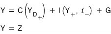
they were the intersections. So we can call them “the equilibrium values of Y in the goods market for each i”!!!!!!
Let me tack on a little interpretation.
Earlier I said the goal economists are after is using policy (changes in T and G) to predict the national economy.
That is, watching the IS curve shift in response to T and G,
this result is

So here, by moving T and G, we predict which way things slide,
and then (T moves things in the opposite direction, G moves them in the same direction — because T had a (-) sign and G had a (+) sign)
we just need to think about how Y moves in response to changes in i.
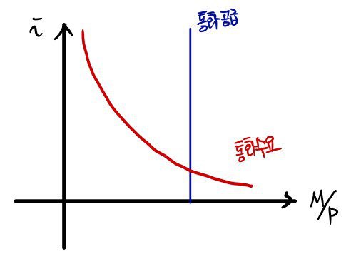
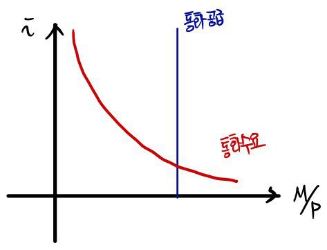
Now let’s derive the LM curve.
First, we need to put the LM relationship from before onto coordinate axes.
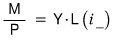
The LM relationship we did earlier was
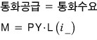
This can also be written like this.
(PY = nominal income — that was the law of three-sided equivalence, which I covered earlier.)

I’m going to rewrite it like this.
Reason being — for a more substantive analysis.
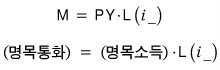
OK so — what coordinate axes are we drawing this on?
These ones!!!!!!!
Drawing the left side and the right side one at a time, carefully —
Got it, right!?!?!?!!!!!!!
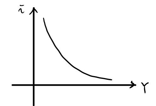
Now we’re going to turn this graph into the i–Y relationship.
Same move as before — plot points as (i, Y) on this graph.
Let me spell it out one more time.
Grab (i, Y) at the current intersection, and then
plot a point on this graph.
Then, running i continuously from =0 all the way to =∞~~~,
we read off (i, Y).
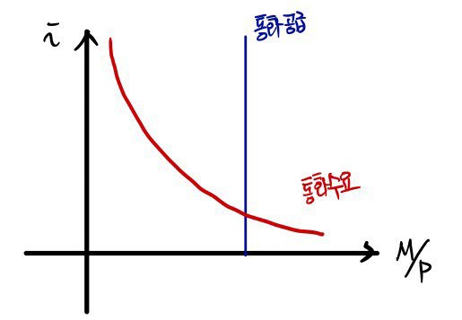
The more i goes up,
the smaller the L function on the right side of the equation gets.
But for the equation to still hold, Y has to get bigger.
Which means: on the i–Y axes, the LM curve takes shape like this.
OK so — gotta dig into the meaning too!!!!
What each of those points on the line means is the collection of equilibrium points of Y as i changes.
Where?!?!?!?!~~~~~~~~~~~~ In the financial market!!!!!
And if we also check how the LM curve moves with respect to the money supply (which the monetary authorities can control) —
if you got the previous process, this one’s a piece of cake.
When the monetary authorities boost the money supply, the intersection slides a bit downward.
That is, at the same Y as before, the equilibrium i drops.
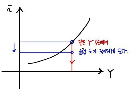
Which means: when money supply goes up,
the LM curve shifts down.
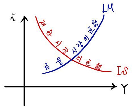
OK so we’ve now derived both the IS curve and the LM curve,
and now we’re going to drop them onto a single i–Y coordinate plane and look at them together!!!
So — what does it even mean to look at them at the same time?
Each point on the IS curve was the equilibrium output of ‘goods’ for a given i.
Each point on the LM curve was the equilibrium ‘income’ for a given i.
The thing we’re about to do — finding the intersection of the IS and LM curves — what kind of point is that, exactly?
“For a given i, what on earth is the equilibrium output (= equilibrium income) at that i!!!!”
Once you’ve drawn this, finding the point is no big deal, and alternatively you can just solve the two curves algebraically as a system —
solving for the variable i, also no big deal.
(Drawing’s the actual problem lol, the functions are too abstract lol lol lol lol go draw them in grad school)
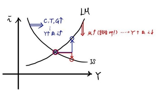
What we want to think about is:
“By what factor is the question of — where i ends up — determined?”
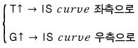
By what ‘action’ does IS or LM shift, and where does the equilibrium i end up~~~~?
So, what we’re going to do is study cause and effect.
Figure out how i or Y changes (effect) when we do something (cause).
Based on what we’ve done so far, we can predict how the equilibrium point will move.
Let me just lump it all together.
I’ll draw the whole lumped-together version.
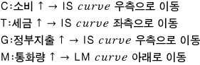
So, the politicians in the world we live in — in order to stabilize people’s lives —
are apparently regulating the equilibrium i and the equilibrium Y by fiddling with the IS curve (changes in T or G) or fiddling with the LM curve (monetary policy, financial policy).
Then I’ll throw out a question I also threw out last post.
“Hey, if you actually run that policy, how long until the effect kicks in?”
(It obviously isn’t going to kick in instantly — I think this is basically asking: when does the Curve move after a policy is rolled out.)
With that question in mind, the “econometrics” people apparently plotted a few indicators showing how stuff moves over time when the Federal Funds Rate (something like the benchmark interest rate) goes up by 1%.
(Solid line: best estimate. Shaded area: the region that holds with 60% probability…)
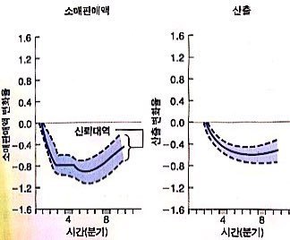
According to the IS curve, a 1% rise in the benchmark rate means C: income drops, and Y drops — that’s what we said, right?!
The left graph confirms both of those mechanisms in real data.
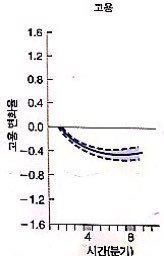
When the benchmark rate goes up by 1%, we also looked at ’employment,’ and it falls with a curve shape similar to output.
We’ll get to this later, but it’s saying: when firms cut output, they cut employment at the same time.
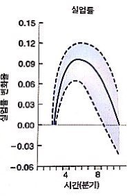
If employment drops, naturally the unemployment rate starts climbing, right??
(But — don’t freak out. The y-axis scale is different…)
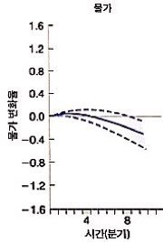
And here’s the important one. You’re aware that this whole time, we’ve been operating under the assumption that the price level P is constant?
This figure is evidence that that assumption is reasonable.
That is — in the ‘short’ term, the price level P doesn’t really swing much in response to the interest rate.
Which means everything we’ve been talking about up till now is reasonable, so I’m feeling good heh heh heh
Short-term analysis: done.
From next time, we’re into medium-term analysis.
Originally written in Korean on my Naver blog (2016-01). Translated to English for gdpark.blog.
Comments
Discussion happens via GitHub Discussions. You'll need a GitHub account to comment.