Deriving the Aggregate Demand and Aggregate Supply Curves
Mashing together the short-run goods/financial markets and the medium-run labor market to derive the AD and AS curves — and spoiler: it still can't explain inflation lol.
OK so what we’re doing from here on out is
deriving the aggregate demand curve and the aggregate supply curve.
Said like that, it probably doesn’t click yet, right?!?
Let me put it differently.
The short-run goods market & financial market,
plus the medium-run labor market — I’m gonna mash them all together real quick.
Why mash them together? I’ll explain that below.
Anyway, by mashing them together like that, we’re gonna derive aggregate demand (AD) and aggregate supply (AS).
Spoiler up front:
the AD-AS Model that you get from mashing the short run and the medium run together like this still apparently can’t explain inflation.
Apparently for inflation, over the next two chapters, they’re going to take this AD-AS Model and extend it into a new one,
so the message seems to be: you’d better understand really well how this one gets built right here~~~.
Alright then. Let’s dive in.
First up,
in Chapter 6, which we just wrapped up,

was assumed,
and that wasn’t really a stretch. (Because in the medium-run equilibrium,

holds.)
The intuition: as time crawls toward the medium-run equilibrium, the gap between the price level people expect and the actual price level slowly closes.
But — in this post we said we’d mash the short run and the medium run together.
So for now,
assuming

would feel like a stretch.
Then we have to throw that assumption out and start over from the top, I guess.
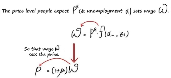
We’re starting from here.
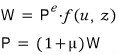
We’re gonna mix these two equations together.

“The price level depends on the expected price level, the markup, the unemployment rate, and the catch-all variable (z) that mops up everything else.”
That’s what this equation is saying.
Now — assumptions are coming in.
** Heads up: Assumptions **
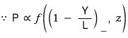
Let’s say μ and z are constant!!!!
And since the unemployment rate as a variable isn’t really a great fit for marching toward an aggregate demand / aggregate supply model,
while keeping the assumption A (labor productivity) = 1,
we’ll write it as

That is,
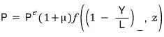
That’s it~~~~~~~ lol lol lol lol lol
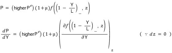
This relationship between Y and P. THIS is AS (Aggregate Supply)!
Huh???? Aggregate supply, just like that? lol lol lol
What is this….
Hmm~~~~~
It’s just that in the equation from the labor market

we didn’t make the assumption!!!
I mean — they could be equal, they could be close, they could be wildly off —
we’ve left all of that on the table.
(What if they happen to be exactly equal~? If we just suddenly lose it and say

is the situation??? Well, that just means equilibrium in the labor market….
Because labor market equilibrium is

)
Looking at it from this angle,
“Wait, why is this thing called ‘aggregate supply’?” — that question kind of bubbles up, right?
The reason it’s called aggregate supply — the answer lives in the graph I’m about to draw. So let me explain the graph first,
and then I’ll come back to why this P–Y relationship from the labor market gets to be aggregate supply.
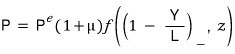
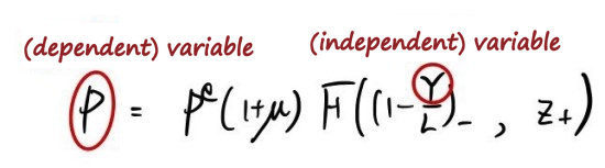
OK now let’s zoom in on P and Y here.
(Holding all the other variables fixed) We’ve got a relationship like Y↑ → P↑!!!!!!
Honestly, Y↑ → P↑ is kind of the natural thing. Listen to this story.
Crank up output → employment goes up → unemployment falls → when unemployment falls → nominal wages go up (∵ wage setting) → firms jack up the markup by that much (∵ price setting) → prices go up.
And another thing this equation is implying:
(Holding the other variables fixed) If the price level people expect goes up, the actual price level goes up.
Why??? People will demand higher wages to match the price hike they’re expecting, then wages go up, so firms bump up the markup and prices rise.
Thinking of
and on axes set up like
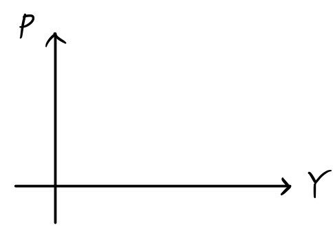
I’m gonna build the graph by plotting points one at a time.
“What on earth does AS even look like~~?”
First, let’s plug into Y the value

.
Because when we plug

into Y, the resulting P is

!!!!
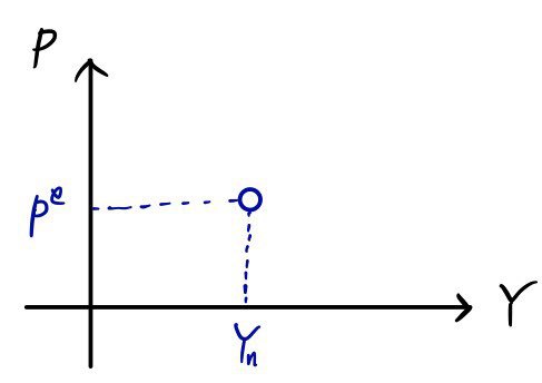
Yeah~~~ That’s exactly one point plotted~! And
now how do we plot the rest.
The P–Y relationship above is being looked at with all other variables held constant,
so we can just draw it sloping up to the right, right?!?
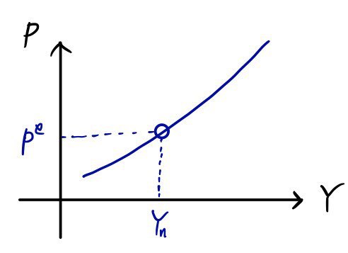
What sets the ‘slope’ at each point?
The shape of the f function, plus those constants we said were fixed — those are presumably the things setting the slope at each point.
Then why does the AS graph happen to be concave up like this, curving upward…
Apparently you go to grad school for that…….? lol lol lol lol lol guess we just accept it and move on.
Now in this setup, imagine people lose it again and
crank up the “expected price level.”
Then for the same

, the corresponding P. That is,

goes up,
so a point gets plotted higher than the one above.
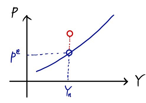
Like this.
And now starting from that red point, shall we think about the P values for the other Y values?
How do we infer the rest of the points.
The slope at each Y could be the same as before, or it could be larger.
It’s ambiguous, because right now we’ve got zero info about the f function, so we can’t say anything definitively.
But — there’s one thing we can say definitively.
It’ll be “similar.” And the points plotted next to that red one will also have a (+) Y–P relationship.
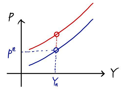
Basically I want to draw the figure like this, but there’s literally no rock-solid condition that tells me I can draw it this way. lol lol lol
But — I’ll say it’ll be ‘similar,’ and draw it like this.
Although — I want to claim it will not be a “parallel shift upward.”
My reasoning:
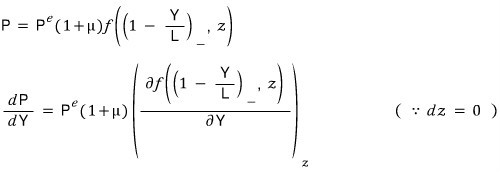
If there’s a mistake, please call me out.
OK so — why is this thing called the ‘aggregate supply curve’ — looking at it now plotted on P–Y axes,
Y↑ → P↑
it draws a graph with the same vibe, the same meaning, as suppliers in microeconomics, and that’s apparently why they named it this.
We’ve wrapped up the derivation of aggregate supply and how AS shifts when P(expectation) shifts!!!
Now let’s derive aggregate demand (Aggregate Demand).
For this one, instead of stating the conclusion first, let’s just walk through it step by step.
The set of equilibrium points in the goods market (Goods market),

— we called this the IS relationship waaay back earlier, remember~~~?
And the equilibrium in the financial market (Financial market),
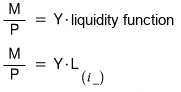
— we called this the LM relationship.
Again!!!! IS is about output Y, and LM is about money!
That is, it was a story about the ‘price level.’
Now, we can say we’re going to mix the two and derive the relationship between Y and P, right?
(Where? In the short run! Short run!)
How are we going to mix them — we’ll mix them using the interest rate i as the bridge.
In other words, the AD curve is the intersection of the IS curve and the LM curve!!!
(The set of equilibrium points of the goods-market IS curve, the set of equilibrium points of the financial-market LM curve, their intersection is… the (Y, i) pair that satisfies goods-market equilibrium and financial-market equilibrium simultaneously, right.)
I’m a little nervous because it feels like the math jargon is suddenly getting dumped all at once, but if anything’s confusing please drop a comment….
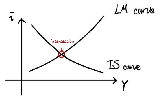
We check the Y and P at the intersection that comes out like this,
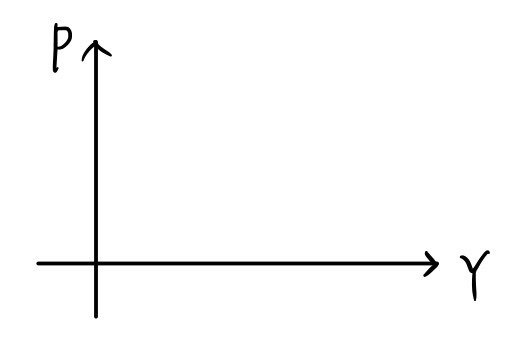
and we ferry them over as a plot onto this graph.
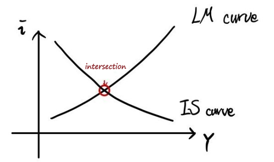
The idea: in this graph, we sweep the value of P, and for each P we map the corresponding Y from the intersection,
and plot it as a point on the
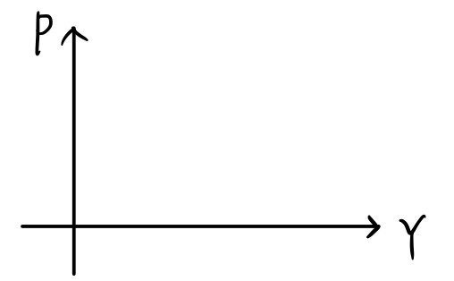
graph.
In the left-hand graph, shall we gently nudge P down?????? Only fiddling with P, the IS curve isn’t touched at all (doesn’t budge),
and only the LM shifts downward. (The reason for that is)
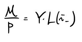
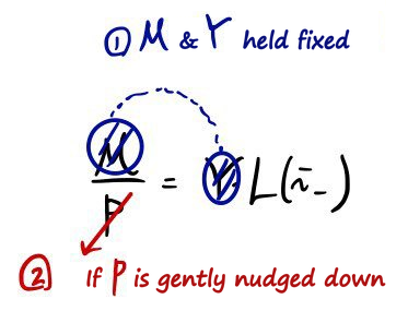
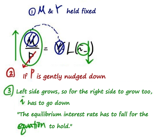
You followed that as P falls the LM curve shifts down, right?????!!!!
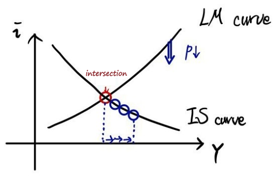
As P falls, the LM curve slides down,
and along with it, the Y that satisfies both the goods market and the financial market simultaneously goes up.
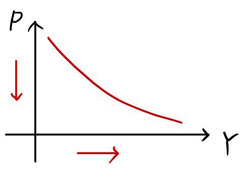
That’s how it gets drawn!!~~~
Let me hammer on the meaning of each of the red ‘dots’ that make up that red ’line’ one more time:
“Equilibrium in the goods market AND the financial market (short-run equilibrium).”
Alright, let’s mash everything onto one picture.
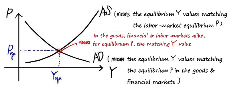
OK now — question time!!!!!!
Is natural output
the same as

?!?!
Nope! Nope! There’s not a single reason they have to be equal.
So from here we’re gonna go case by case.
Say…

natural output sat
below

.
Oh!!!!
The equilibrium P from the labor market corresponding to

would be

!!!! (we learned this earlier.)
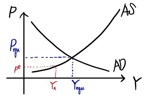
In this situation, people are gonna think:
“Ugh!!!!! The current price level is way higher than what we were expecting!!!”
“Feels like prices are gonna keep rising!!!!”
Thinking like that, people set the expected price level higher, right?
And we said that when the expected price level goes up, the AS curve shifts up!!?!
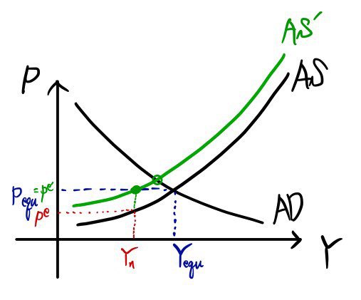
The AS curve has nudged up a bit.
But the actual price level is still higher than what people were expecting, so
“Ugh!!!! Feels like it’s gonna rise again!!!”
The AS curve is gonna shift up again, right??!
How far will it rise?!?!?!!
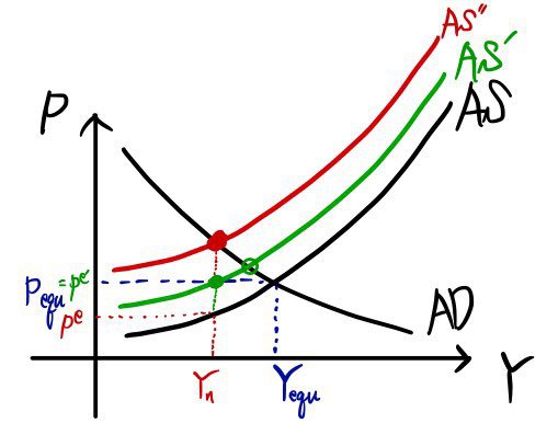
“Phew phew~ OK now it’s about right~”
It’ll move up to here.
That is, until P(e) = P(equ).
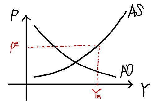
Starting fresh,

if natural output sat
above

it’d go like this:
“Oh~? Current prices aren’t quite as high as we thought, are they? (short run)”
And so they’d revise the expected price level downward, and the AS curve would slide down.
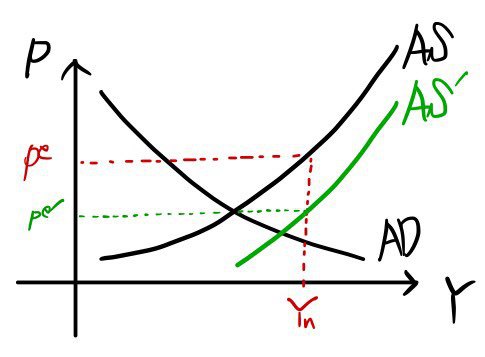
Like that, P(equ) gradually walks down along the AD (movement),
and once again P(e) gets readjusted, right?!
“Yeah, still not that high~~~?!”
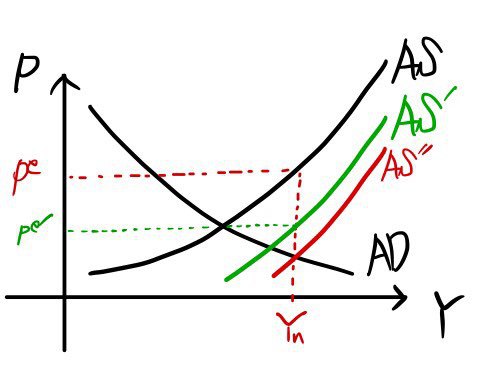
This is saying AS keeps moving until P(e) and P(equ) line up.
Up to here we’ve stitched the short run and the medium run together,
and seen how the short run lines up with the medium run as time goes on!!!!
So then — if the monetary authority changes M,
if the government changes T or G,
if firms change their markup — let’s take a look at how prices and output respond.
In the next post….
Feels like if I cram all of that in here too it’ll get really long.. heh. heh heh
Comments
Discussion happens via GitHub Discussions. You'll need a GitHub account to comment.