The Phillips Curve: Unemployment and Inflation
Diving into the Phillips curve — why the unemployment-inflation trade-off was such a big deal, how we derive it from scratch, and why it totally fell apart in the 70s.
OK so with the last post, we’re officially done with aggregate demand–aggregate supply.
Like I said before — now we’re moving on to inflation.
Up until now we’ve been staring at the price level, but we haven’t actually looked at the rate of change of the price level, right????
That’s what we’re getting into now.
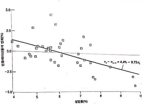
Apparently economists from waaaay back have been super curious about inflation. Then in 1958, this guy Phillips plotted the unemployment rate against inflation, year by year, for the UK from 1867 to 1957!!!!
And the chart showed a clean (–) relationship between unemployment and inflation. Beautiful.
You’d think the story ends there — “oh nice, inflation and unemployment are tightly linked, cool.”
But two years later, Samuelson (Paul Samuelson) and Solow (Robert Solow) went, “Hmm, does what Phillips found also work for the US?” and used US data from 1900 to 1960. And lo and behold — same deal. Negative relationship between unemployment and inflation in the US too.
So this thing exploded. It went from “interesting empirical pattern” to “actual policy doctrine” real fast.
Countries actually started agonizing over policy with it: tolerate high unemployment to keep inflation low, or tolerate high inflation to keep unemployment low? That kind of trade-off.
But — and here’s the punchline — from the 1970s onward, the Phillips curve just stopped working. Like, the relationship completely fell apart.
So the goal of this chapter is: why did the Phillips curve work back in the day, how do we derive the thing, and why doesn’t it work anymore? What broke?
Let’s go~!!!~
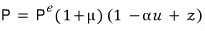
From here on we’re tracking the rate of change of $P$, so let me pull in the equation for $P$ that we’ve been carrying around.
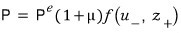
This guy.
Honestly… I really don’t want to look at it. But here we are.
That function $f$ — instead of leaving it as some abstract function, let’s just assume something concrete for how it depends on $u$ and $z$. Square root? Linear? Quadratic? Pick one.
That’s actually what people do in econometrics, more or less.
Let’s just go simple — first-order linear. Because the whole point right now is to take the simplest possible model and get a brooo~ad general feel for how the world works.
So:
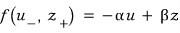
Throw in some coefficients like that.
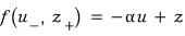
But wait — the coefficient $\beta$ doesn’t really mean anything. $z$ was already a grab-bag variable lumping random stuff together, so multiplying it by some $\beta$ is kinda meaningless, no????? Let’s just ditch it.
$\alpha$, on the other hand — that means something. You can read it as “how strongly the unemployment rate is pushing on things.”
And — can I just sneak a little $+1$ in here?????
The reason for the $+1$ is to make a calculation way cleaner later. Trust me.
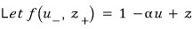
That is —

this thing.
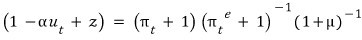
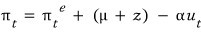
OK, this equation. We’re gonna swap it into something with $\pi$, the inflation rate!!!!
First, let’s rewrite it “for some time $t$” —
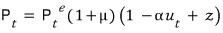
— so that everything in there is the value for year $t$.
<price level in year $t$, expected price level in year $t$, unemployment rate in year $t$>
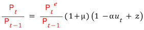
Now we’re gonna play with this equation.
Why? Because inflation $\pi$ means

so we want to massage the equation into that shape. Alright, let’s mess with it.
Multiply both sides by

.
Then we’re gonna add $+0$ to the numerator and denominator — but a fancy $+0$. A grand $+0$.
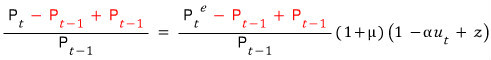
Rewrite that thing as:
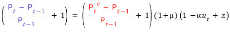
Meaning of blue: how much (as a ratio) it changed relative to the original price level — that’s the inflation rate! : $\pi_{t}$
Meaning of red: how much (as a ratio) it’s expected to change relative to the original price level — : $\pi_{t}^{e}$
OK at this point let me drop in one tool!!!!
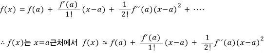
Namely, Taylor Expansion.
(Taylor series approximations don’t just show up here — they’re gonna keep popping up. They’re used absurdly often in tons of fields. Physics uses them an insane amount, heh heh heh.)
When $f(x)$ is near $a$:
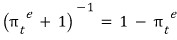
I didn’t just yank that math in out of nowhere —
we’re gonna use this as our approximation.
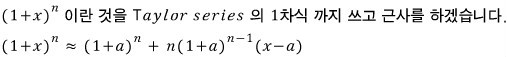
Plug $n = -1$ into the formula above and it’s immediate.
So following the Taylor approximation… that theorem above:

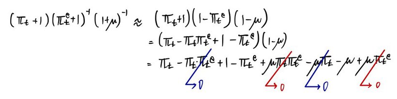
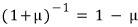
Do not forget the assumption.
Approximating like that means $\pi_{t}^{e}$ and $\mu$ are assumed to be reaaaally close to $0$!!!!


Why did we kill the blue-zero term in the photo above? Because $\pi_{t}^{e}$ or $\mu$ multiplied by $\pi_{t}$ is too~~ small — those terms barely move the needle compared to the other $\pi_{t}$ sitting in the equation.
So screw it, drop the small stuff!!! That’s why we zeroed those out.
And the red-zero term? That’s two near-zero numbers — $\pi_{t}^{e}$ and $\mu$ — multiplied by each other. Which makes them even-even-even-even-even-even closer to zero. So yeah, gone~~~.

Now now now now — how each variable’s movement drags the other variables around? This near~~ly glorious approximation lets you eyeball the whole thing in one go.
And just like that, we’ve derived the relationship between the inflation rate and the unemployment rate!!!!
Buuut we can’t fully say this is what the Phillips curve was getting at!!!!!! Because there’s that pesky expected inflation rate sitting in there?!?!?!?!!???
Phillips did not derive the equation above and then read off the Phillips curve!!!!!
Phillips just stumbled into it (lucky?) (though “lucky” is a bit harsh)…
He just spotted a pattern in the data, right?? He went “Whoa!?!!!!?!?!?!? The unemployment rate and inflation rate are inversely proportional!!!>!!?!?!!! Eureka!!!!!!!!!!!!!!!!!1”
So the era was kind to Phillips — meaning back then,
apparently.
And that’s what made the unemployment-rate vs. inflation-rate inverse relationship — the Phillips curve — actually hold!!!
Why does the relationship work when expected inflation is $0$?
You can wave your hands and explain it in plain words. This thing is called the wage-price spiral.
Goes like this:
Unemployment falls, and people’s expected rate of price change is $0$
↓
Nominal wages go up.
↓
Firms raise prices.
↓
Prices go up.
↓
People demand higher wages.
↓
Firms raise prices again.
↓
.
.
.
But in modern times it doesn’t hold, right?
The reason: as the modern era rolled in, people opened their eyes to the economy, and the concept of $\pi_{t}^{e}$ planted itself in their heads. It’s no longer always

!!!!!
So why did this concept take hold around the ’70s?!
The Hottest hot issue back then? Oil price surge — the oil shock, right?! Honestly I don’t think it’s an exaggeration to say people just got one hit from that and the concept was born… And on top of that the ’70s had two oil shocks.
So how did the concept form in people’s heads, you ask —

A thought about the “persistence” of inflation bloomed in their heads.
That is, for $\pi_{t}^{e}$, people started thinking of it as $\theta \cdot \pi_{t-1}$.
(“compared to how much it went up last year~~~” — that vibe.)
In other words: originally people were running around with $\theta = 0$, but gradually they crept toward $\theta = 1$… (the expectation that it’ll rise this year by the same amount it rose last year.)
That’s the trend that took over.
Here, the $\theta \approx 0$ situation is the one Samuelson and Solow caught when they were looking at the US.
<Yeah~ that would’ve looked pretty Phillips-curve-shaped.>
And and and and and and~
As time went on, people’s heads drifted toward $\theta \to 1$, and so
with the red equation,
when you observe the change in the inflation rate like this,
this is called the ‘modified’ Phillips curve or the ’expectations-augmented Phillips curve’ — and this is the Phillips curve that captures the inflation-rate vs. unemployment-rate relationship in the modern world.
Everything we did before was a lie.

lol lol lol lol lol lol lol lol lol lol lol lol lol lol
Friedman (Milton Friedman) & Phelps (Phelps) just yeet the Phillips curve out the window.
“Hey, fine, let’s grant that the Phillips curve is correct. By the Phillips curve, if people just grit their teeth and tolerate a high inflation rate, they can enjoy a low unemployment rate forever, right?????”
Now think about that.
Does that sound right?
Suppose the government commits to riding out high inflation in exchange for low unemployment.
Oh — then $\Delta \pi_{t}$ is some fixed number.
What does fixed mean here? Wages up → prices up → wages up → · · · · · forever, at the same clip.
This doesn’t make sense, they’re saying.
That is: “wage-setters aren’t gonna keep making the same mistake forever!!!!!!!!!!!!!!!!”
So these guys said: the unemployment rate has no choice but to settle around some particular level.
They called this the natural rate of unemployment…
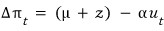
Right right, so what is the natural rate of unemployment? It’s the unemployment rate when today’s price level equals the expected price level. That’s the natural rate of unemployment.
Then in this chapter, sticking with the notation we’ve been using…
the unemployment rate when $\pi_{t} = \pi_{t}^{e}$ — let’s call that $u_{n}$.!!!!
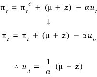
So if we sub this freshly-introduced $u_n$ into
,

What this equation is saying: “inflation is what shows up when there’s a gap between $u_n$ and $u_t$~”
<That’s also why the natural rate of unemployment $u_n$ is called NAIRU (non-accelerating inflation rate of unemployment)! ‘NAIRU’ is one of those standard econ terms — I’ve heard of big-company entrance exams asking about it.>
It didn’t mean that we need to learn it just because big companies put it on their tests (T_T)
Originally written in Korean on my Naver blog (2016-01). Translated to English for gdpark.blog.
Comments
Discussion happens via GitHub Discussions. You'll need a GitHub account to comment.