Price Consumption Curve and Demand Curve
We trace what happens when the price of good x keeps dropping, connect all the utility-maximizing bundles into a price consumption curve, and boom — that's literally where the demand curve comes from.
Alright, let’s talk demand theory.
At its heart, demand theory is just about the relationship between price and quantity. That’s it.
Honestly, it’s nothing fancy — think of it as zooming in one notch tighter on the stuff we did all the way back at the start.
It really is nothing more than an extension of the budget line + utility function business we’ve been hammering on this whole time!!!
OK OK OK OK, let’s go go go!
So what we’ve been doing up to this point is —
we’ve got this constraint called a budget line,
and the whole idea is: humans, being humans, will squeeze out maximum individual utility under that constraint —

so they pick the $(x, y)$ bundle right at this sweet spot.
That is, literally, the entire story.
But hold on. The demand curve we know —
isn’t the demand curve the thing that asks “how much $Q$ will you buy at price $P$?”
So how on earth is that an extension of what we just drew up there??!?!??
OK OK OK, I’ll show you.
Let me start by sketching it like this.
OK, we’re going to focus on good $x$.
So — pin down the price of good $y$,
and then gradually lower the price of good $x$. And as we slide it down,
we’re going to watch how a human picks the quantity of $x$ that maximizes their utility.
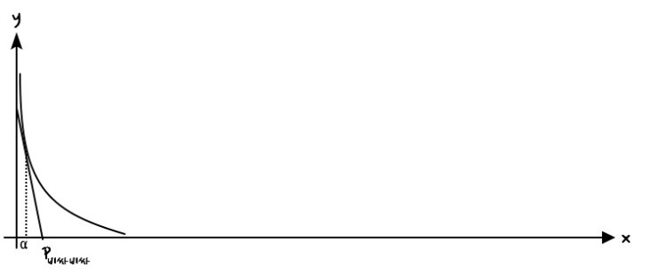
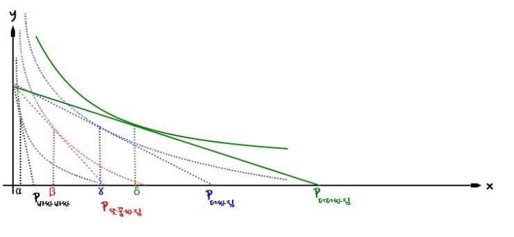
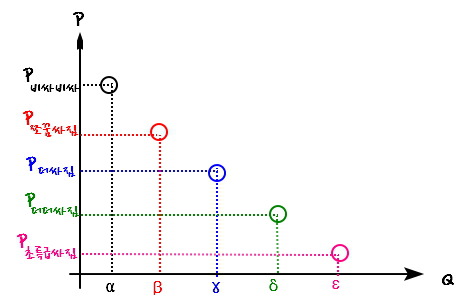
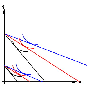
To break down the diagram above: when the price of good $x$ is

we figured out this person picks $\alpha$ units of good $x$.
Now let’s see what happens when the price drops to

When good $x$ gets a little cheaper, the budget line tilts like this,
and to max out utility at this new spot, they’ll decide to grab this much of $x$.
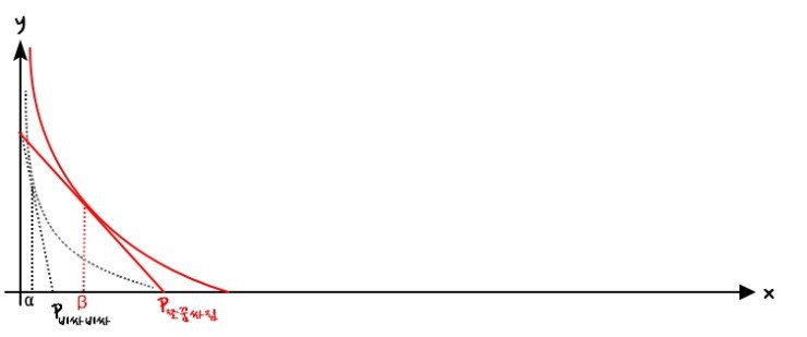
Right there, they pick $\beta$ units of good $x$ ~~~~
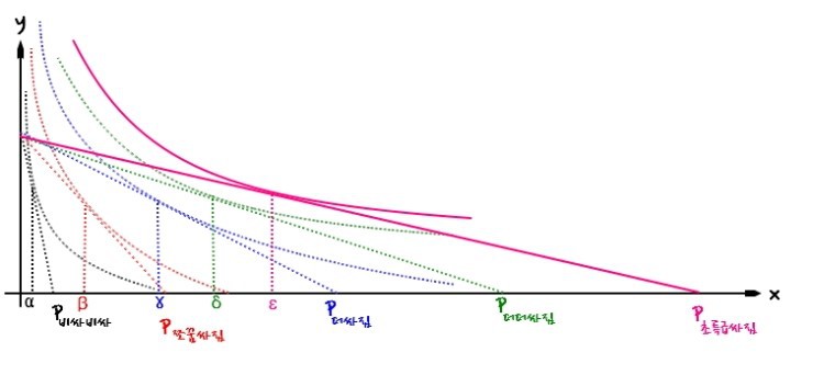
Now let’s also peek at when the price of $x$ is

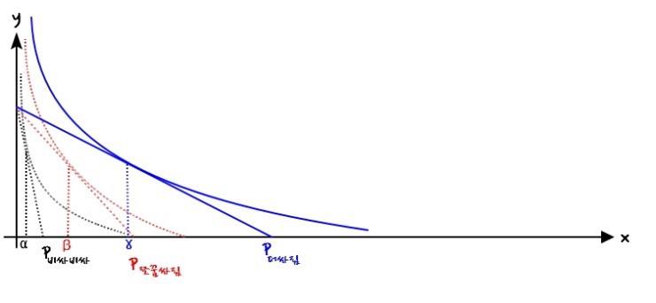
And for the next two — when it’s

and when it’s

I’m just gonna slap them together in one go.
Did everyone catch that?!?!?!?!??
$\alpha < \beta < \gamma < \delta < \varepsilon$ — you all caught that too, right.
OK let me lock down one concept before we keep going.
For each new price of good $x$,
the curve that connects (as dots) every utility-maximizing bundle —
that’s called the price consumption curve.
Let me draw it on the plane up there.
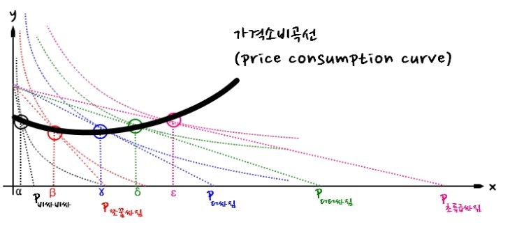
One concept locked in.
Then let’s keep moving.
OK, now I’m gonna extract some info.
The way I’ll pull info out is like this —
(each price of $x$, the chosen quantity of $x$ at that price)
I’ll yank them out as ordered pairs. And boom — info comes pouring out.

This info we just extracted,
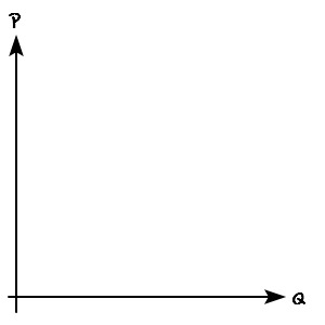
we’re gonna throw onto this graph right here@@@@@@!!!!
Easy stuff.
Let’s plot it.
Whoa@@@ Plot it like that and we don’t get a line@@@@
So if we actually want a smooth line, we’d have to plot basically infinitely many points,
which means… what do we have to do??!?!??!?
We need a ton of price-quantity pairs for infinitesimally small changes in the price of $x$….
Who should be doing all that????lol
A computer should do it heh heh heh
So let’s say a computer went and did it@@@@@
Then we’d get something like this~~~
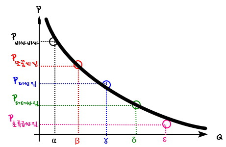
Whoa…
So that’s how the demand curve gets derived…..
But — clearly, way back at the beginning, and in any general or intro econ course in lower-division undergrad —
we clearly derived the demand curve using willingness to pay.
But… what is THIS?????????? (sob)
No@@@ Willingness to pay is in here too@@@
It’s just hidden.
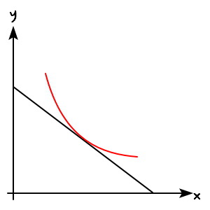
What was the slope of the tangent line on the utility function???? We said it was the MRS.
That’s the number that says: in exchange for giving up some $y$, how much $x$ do you need to keep your satisfaction level the same~~~
And here, the MRS at each tangent point equals the slope of the budget line,
which means: that’s how much $y$ you’re willing to pay in exchange for $x$.
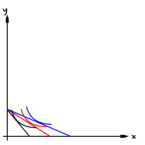
So check it — the willingness to pay
grows as good $x$ gets cheaper. (Because the slope flattens out.)
Which means: the reason $Q$ gets bigger as $P$ gets smaller on the demand curve
is because willingness to pay is getting bigger.
Yeah… I just wanted to point out it’s all the same story we’ve been telling.
OK so we’ve looked at this from the price-of-the-good angle.
Now let’s look at it from the income angle.
Everyone probably knows this as common sense.
When income goes up, the demand curve shifts right too, right???
But since we just derived the demand curve rigorously (at the ultra-micro level), don’t you have a feel for why that happens?????
If we measured someone’s demand curve like this,
and suddenly their income jumps up,
What happens is — the demand curve slides to the right, with prices held fixed.
This time I was planning to also derive something called the income consumption curve to classify types of goods, but if I keep going here this post is gonna get way too long.
So I’ll save it for the next posting@@@@
See you next time~~
Originally written in Korean on my Naver blog (2016-07). Translated to English for gdpark.blog.
Comments
Discussion happens via GitHub Discussions. You'll need a GitHub account to comment.