Engel Curve and Income Consumption Curve
We derive the income consumption curve and Engel curve step by step, then use their shapes to figure out whether a good is normal or inferior — think ramen vs. electricity.
Alright, this time we’re deriving something called the income consumption curve.
It’s in the same family as the price consumption curve, but honestly? The income consumption curve matters more. A lot more.
Why? Because the shape of the income consumption curve lets us classify goods into different types. That’s a big deal.
OK so first, let’s nail down what the income consumption curve even is before we go anywhere.
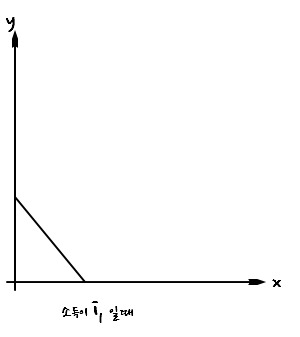
When income is $i_1$, a person stuck with that particular budget line is going to consume the $(x, y)$ pair sitting at the tangency point up there — that’s the bundle that maximizes their utility within what their budget allows.
Like so.
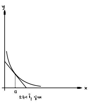
But now — let’s say this person’s income bumps up a bit.
The budget line shifts outward, and they’re going to reshuffle how much $x$ and how much $y$ they buy, again squeezing out the most utility they can given the new (larger) feasible region.
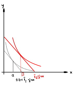
And let’s say income goes up one more time~
Same deal. New income, new budget line, new utility-maximizing bundle.
Gooood.
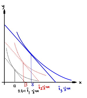
So here too, we’re only paying attention to the utility-maximizing points at each income level.
Imagine we did this an infinite number of times. Tangency point after tangency point after tangency point. Connect all those infinitely many dots and you get a curve that looks like this:
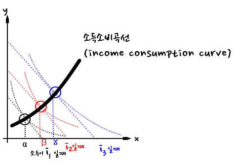
That’s the income consumption curve.
Now — there’s something I didn’t say out loud, but I’ve been quietly tracking it the whole time.
When income is $i_1$, the utility-maximizing quantity of good $x$ is: $\alpha$
When income is $i_2$, the utility-maximizing quantity of good $x$ is: $\beta$
When income is $i_3$, the utility-maximizing quantity of good $x$ is: $\gamma$
That’s only three so far, but pretend we’ve collected infinitely many of these (income, $x$) pairs. Now — where should we plot them?
On axes like this.
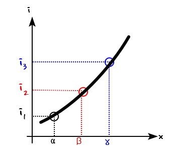
And we get a curve. This curve has a name — it’s called the Engel curve.
<Don’t mix these up: the income consumption curve carries info about both goods $x$ and $y$ as income changes, while the Engel curve only tracks one good — good $x$ — against income.>
A good whose Engel curve slopes upward to the right, like the one we just drew, is called a normal good.
Hmm… what’s an example? Heating? Electricity? As your income climbs and climbs, you stop worrying about the bill and just crank it, so consumption keeps going up, right?!?!
But — does every good we run into look like this?!?!
Nope, right???
Back when I was a student with no income, I lived on ramen. Then I got a job, had a little cash, and suddenly I almost never eat ramen anymore…
It’s just not true that more income = more spending on every single thing.
What other examples? Cheap fast-food burgers? Generic store brands? Instant coffee packets??
OK, let’s try to sketch the Engel curve for one of these.
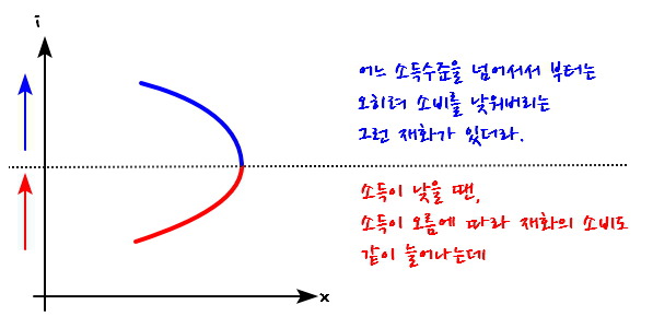
A good whose Engel curve looks like that is called an inferior good.
<More precisely, you’d say: “at the red income range it acts like a normal good, and at the blue income range it acts like an inferior good.”>
Originally written in Korean on my Naver blog (2016-07). Translated to English for gdpark.blog.
Comments
Discussion happens via GitHub Discussions. You'll need a GitHub account to comment.