Isoquants
We bring K back into the picture, plot the whole Q = f(L, K) surface in 3D, then slice it to see what isoquants actually are — infinite (L, K) combos that spit out the same output.
Last time,
we made it up to here:
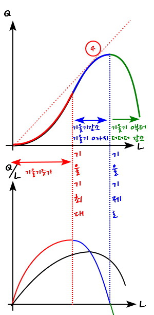
I drew MP_L and AP_L on top of each other and called it a day.
So now let’s keep going.
Up until last time, I said Q depends on two variables, L and K — but we pinned K down as a constant and only looked at how Q moved with L.
This time, I’m bringing K back into the picture.
Q determined by two variables — OK, how do we picture that?
Like this:
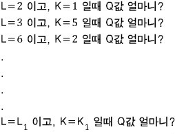
Say we collect a ridiculous number of (L, K, Q) sets like this,
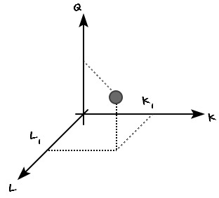
like that — treating L and K as continuous variables — and we pull out an infinite number of Q values, one for each (L, K) ordered pair, and drop them as points into a 3D coordinate system.
We’re plotting it.
End result: if you plot infinitely many points, you get something like this.

Oh wait, no.
There was THIS one!!
I’ve got one I drew in Matlab.
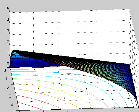
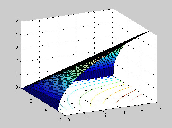
Ah — but this is the final form, for later. heh heh heh.
There’s a bit more I need to say first, so for now let’s roll with this picture:

Earlier, when I drew Q = f(L), the whole premise I tossed out was “K is constant.” And when K is constant,
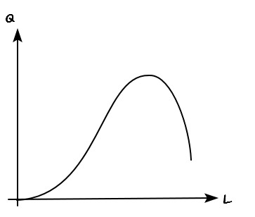
I said it gets drawn like this. And that graph —
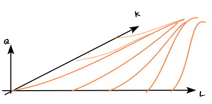
— must still be sitting somewhere inside this 3D surface too, right?
But where?? Is it hiding in there??????????
Yes yes, it’s hiding in there. Let me overlay it for you.
Ahhh-ha~~~
When K is fixed at a small value, the curve isn’t that bendy. When K is fixed at a large value — the bigger we fix it, the more curvature you get.
Doesn’t seem unreasonable.
Let’s think about it for a sec.
When the K we’re holding fixed is bigger, Q gets more sensitive to L — more bang per unit of L, efficiency-wise. And “sensitivity” on a coordinate plot is just slope.
Hehehe, things are clicking now. heh heh heh
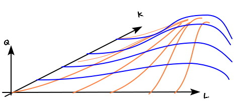
OK so we’ve plotted every point in the L-K-Q system.
Now the spot we want to zoom in on is
“the places that produce the same output (Q).”
To pin down only the points with the same Q value, we slice this graph perpendicular to the Q axis.
After slicing, some line pops out. Every point on that line means “same Q value.” And that line looks like this.
(Picture taking a knife and going whoooosh parallel to the LK plane.)
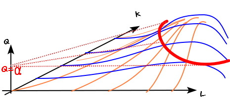
If you swoosh~~~ cut with the plane Q = α, you get that red line.
Every point on that red line has Q = α, and each one is a different (L, K) ordered pair.
In other words, the ways to produce Q = α aren’t pinned down as
L = (some value), K = (some value)
— there are infinitely many combinations that work.
(Same idea as the utility function.)
This line is called an isoquant — equal-quantity curve.
(The textbook compares the isoquant to a contour line on a map, and I’ll skip walking through that, but file it away for reference.)
Isoquant — set of points with the same Q value.
Contour line — set of points with the same ’elevation’ value.
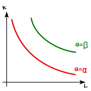
OK, so on that picture above, let me draw just one more isoquant — this time for Q = β, where β > α.
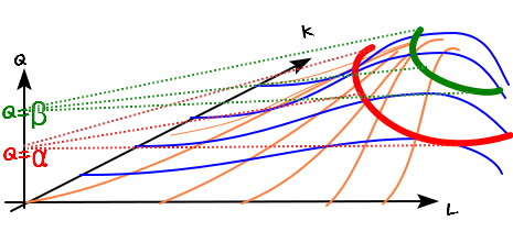
Now — where are we going to look at these two lines from?
I’m gonna park my eyeballs right here.
We’re looking from here. heh heh heh heh heh
And from this angle, each isoquant looks like this.
Isoquant derivation done~~~~~~~~~~~~~~
But — OK, I know everyone’s going to have a question.
“Hey hey hey hey hey hold on…(annoyed face)? Done??”
That’s the face you’re making, isn’t it. heh
Yes yes yes yes yes yes yes yes yes.
I’ll pick up right from there next time.
See you in the next post — calling it a supplementary section.
Originally written in Korean on my Naver blog (2016-07). Translated to English for gdpark.blog.
Comments
Discussion happens via GitHub Discussions. You'll need a GitHub account to comment.