Economies of Scale and Diseconomies of Scale
We poke at what happens to TC when factor prices move, work through output elasticity of cost, and land on exactly what economies vs. diseconomies of scale actually mean.
Up to now we’ve quietly been assuming $r$ and $w$ are constant, and we built up TC under that assumption.
So this time, let’s poke at it. What happens to TC when factor prices actually move?
Since the thing we want to isolate is “what does a factor price do to TC,” let’s hold $w$ fixed and let only $r$ change.
We’ll reason it out roughly using the graph below — the shape that, apparently, shows up generally in real industrial settings.
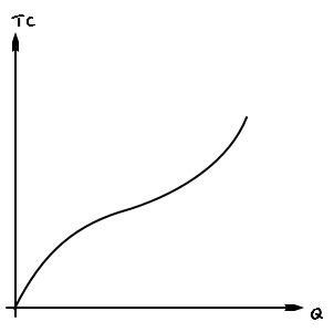
Remember, the TC curve was the thing you get by connecting the minimum TC needed to produce each $Q$.
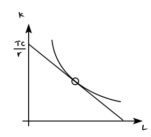
These points right here.
But — if $r$ rises, the isocost line tilts toward the flatter direction, right?????
(You can also explain it as: “$r$ goes up, so the $y$-intercept goes down.” Same thing.)
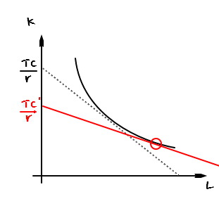
So the cost-minimizing tangent point moves over there.
TC became TC’. Did it go up compared to before? Or down??????
(I mean… isn’t it kinda obvious it goes up? $w$ stayed the same, $r$ went up. Of course TC goes up.)
Still, let’s actually think about it.
We need to figure out which is bigger, TC or TC’. So I’ll draw in one auxiliary line.
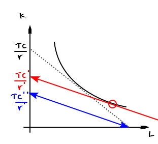
Drawing it in like that,
$$\frac{TC'}{r'} > \frac{TC''}{r'} \quad \text{therefore} \\ TC' \quad > \quad TC''.$$Now look right here.
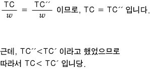
The $x$-intercept here can be read as
$$\frac{TC}{w}$$and it’s also fine to read it as
$$\frac{TC''}{w}.$$Which means:

Following this same logic, on every region with $Q > 0$ (not $Q = 0$), as $r \uparrow$, TC $\uparrow$.
So:

It “rotates rather than parallel-shifts,” like that.
<But hold on — this is long-run analysis, so there’s no fixed cost. Note that $TC(0) = 0$!!!!>
While we’re here, let’s wrap up the elasticity discussion too.
Just like price elasticity of demand, here we’ll think about the “output elasticity of total cost.”
Definition: “if output changes by 1%, by what % does total cost change~~?”
Writing that out as a formula:
$$E_{TC,\,Q} \;=\; \frac{\dfrac{\Delta TC}{TC}}{\dfrac{\Delta Q}{Q}}$$Now if we play around with this thing a little,
So so so so, it kinda looks like it’ll come out clean like this.
Yeah, fair to say it organizes like this.
But hold up — let’s think about what this actually means.
When output moves by 1% and total cost moves by less than 1%, that’s an extremely efficient zone.
Because it means: pour in a little more input, and cost barely budges!!
“If I were you, I’d spend 25% more in cost and crank production up by 60%!!!” — it’s the regime where you can pull moves like that.
That is, it’s exactly where economies of scale kick in.
Flip it around: when output moves by 1% and total cost moves by more than 1%,
like, “I bumped costs by 50%, and output went up… 10%?!?!?!?!!!!”
That’s the regime where diseconomies of scale show up.
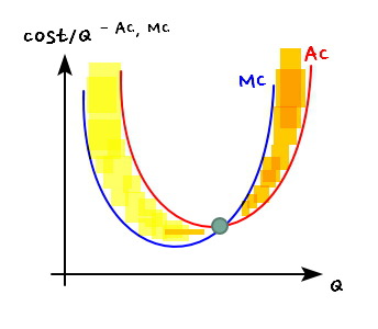
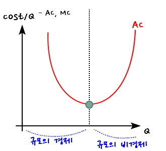
So! The range where $MC < AC$ is the range where economies of scale are doing their thing, and the range where $MC > AC$ is where diseconomies of scale take over!!!
Why this isn’t weird at all:
$MC < AC$
Let’s say 10 won $<$ 500 won.
You’re in a situation where, on average, it costs 500 won to make one unit. And then somebody tells you: spend just 10 more won, you get one more unit.
If you were the CEO — are you spending that 10 won? Or not???
Hmm… so in the economies-of-scale zone, you’d think “let’s just keep cranking production up forever”…. but no, that’s not the right takeaway either!!! lol lol lol lol
Apparently Louis Vuitton straight-up throws away carry-over products. And also throws out the not-carry-overs.
So yeah…
I’m tossing that Louis Vuitton aside in here in case anyone misreads what I just said.
Let me do this on the graph too!!!
We said MC and AC with respect to $Q$ get drawn like this on the same axes.
That is —
Ohhh~~~ so the yellow part where AC is heading down is where economies of scale are happening~~~
Ohhh~~~ and the orange part where AC is climbing back up is where diseconomies of scale are happening~~~~
(One more thing here — the range where neither economies nor diseconomies of scale happen…. the range where bumping $Q$ doesn’t move AC up or down, is ‘just a single point’~~~!!!~~)
So even if you only draw the AC curve, you can read off: up to what $Q$ economies of scale are in play, and from what $Q$ on diseconomies of scale kick in.
So… does this mean every industry in the wild looks exactly like this!??!?!?!!!???
No no no no no — this is the story for a single firm. Apparently for the market, we don’t think of it this way at all!!
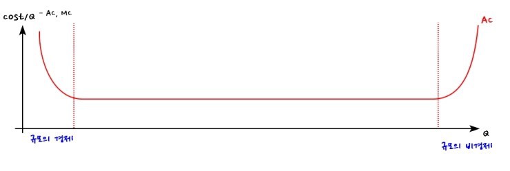
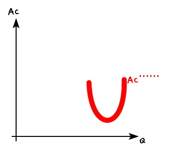
A lot of economists think the market-level AC curve looks more like the picture below.
(This is where you start to feel the gap between social science and natural science. You make a phenomenological assumption, and if it explains the data when you crank it through, ok ok, ship it. Natural science isn’t really like that, riiight….? heh heh heh. And while saying exactly this, the econ professor… looked over at me, a physics major, and dragged physics into the dirt lol lol lol lol
Said physics was, like, a thing the world doesn’t even need lol lol lol lol oh come ON lol lol lol lol lol lol
Bro I was BOILING!!!@@@@
But of course I didn’t have the guts to fire back “Physics is not like that@@@@@@@@@@@”
I just went “hee hee yes yes~ :D” while inside, fuming lol lol lol)
OK but if an economist is convinced the curve looks like that, there’s gotta be some evidence behind the conviction, right????????
The story is: it can be explained by market entry and exit, plus the copying of technology.
The logic gets a little loose in places, so read it with a forgiving eye.
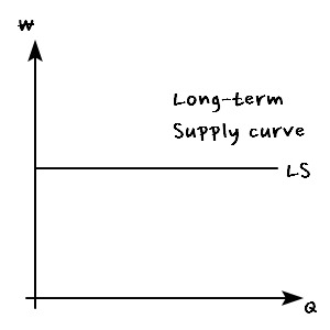
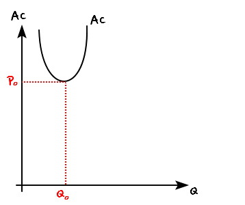
Suppose some first-mover firm rolls in with a technology like this and is producing at price $P_0$, output $Q_0$.
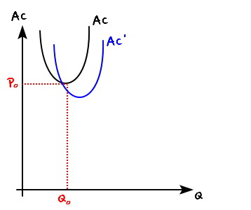
But pretty soon another firm copies the tech, tweaks it a bit, drops the price, and manages to push out more output too.

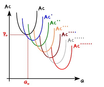
And this keeps happening. Over and over.

Eventually you end up here…
But because entry into the market is too free, and the tech keeps getting copied, more and more and more and more and more and more and more and more and more and more and more and more and more firms pile in copying it…(sob)(sob)(sob)

All those AC curves end up stacked here…. heh heh heh..////
And now this concept feeds straight into
’the supply curve in a perfectly competitive market.’

heh heh heh
Originally written in Korean on my Naver blog (2016-07). Translated to English for gdpark.blog.
Comments
Discussion happens via GitHub Discussions. You'll need a GitHub account to comment.