Short-Run Total, Average, and Marginal Cost Curves (STC, SAC, SMC)
We flip from long-run to short-run, lock K down as a constant, and split total cost into TFC + TVC to build the STC curve — which, unlike long-run TC, doesn't pass through (0,0)!
Last time we wrapped up TC, AC, and MC — and through that whole conversation we were free to crank L and K around however we wanted, no constraints.
Yeah. That whole discussion basically assumed the firm could freely pick its L and K,
which is the long-run perspective.
So now we flip the camera and look at things from the short-run perspective.
Quick reminder from way back: the difference between long-run and short-run isn’t really about how much time has passed —
it’s about whether you have flexibility in your decision-making.
Short-run = no flexibility. One of L or K is locked down.
OK so, like before, let’s pin K. K is now a constant, $\overline{K}$.
Cost per unit of capital is $r$, so the cost coming from $\overline{K}$ is $r\overline{K}$.
Hold up — if $r$ doesn’t change, then $r\overline{K}$ is also a constant!!! It doesn’t move!!!
So $r\overline{K}$ is what we call the Fixed Cost.
Total Fixed Cost, abbreviated: TFC = $r\overline{K}$.
Then there’s the cost from L, which can change: $wL$.
This one’s a variable (because L wiggles).
Total Variable Cost, abbreviated: TVC = $wL$.
Add ’em up and you get Total Cost (TC)!!!
But — to keep it separate from long-run TC, we call TFC + TVC the STC (Short-run Total Cost).
OK now, just like before, we’re going to draw a curve on the axes:

Same logic as before.
I’m not going to grind through the logic again here.
Honestly, just think of it as the cost coming from variable L only.
And if you want one go-to reason for why it’s drawn this shape, the answer is “efficiency.”
For details, see #36. (http://gdpresent.blog.me/220759772087)
Total cost, marginal cost, average cost [ Microeconomics I Studied #…]
Huh???? A cost curve??? Didn’t we do this before???? You might think so, but what we did before was iso-cost…
gdpresent.blog.me
We also need TFC
so we can mash TVC + TFC together to draw STC.
So — let’s draw TFC!!!!
TFC’s easy lol it’s a constant.
Just slap down a constant function.
Now let’s lump the two together.
Now should we draw the sum of the two functions —
i.e. STC??!?!?!?!
The sum looks like we can just take the TVC curve and shift it up along the Cost axis by $r\overline{K}$!!!!!

Remember when we drew TC earlier and I made a huge deal about it passing through (0,0)?
Yeah.
The reason I hammered that is because STC, by its very nature, does NOT pass through (0,0)!!!@@
Translation: “even if you produce 0 units, in the short run there are still costs being burned”!!!!
OK so right around here you might be having a small mental breakdown.
Wait?!?!?!?!
The shape of TC was!!!
like this — but that was the long-run perspective, you said —
then now we’re switching to short-run
and the short-run STC is
shaped like that?!?!?!
Huh???????????????????Then
if you just take the long-run curve and shift it up along the y-axis by $r\overline{K}$, doesn’t that give you STC????
You might be thinking that.
That’s a misunderstanding, and it’s clearly wrong.
Why? Because at no point when explaining either graph did we ever pin down the functions algebraically. We just sketched the general shape.
And more fundamentally — the long-run analysis traced the set of costs that hit the real minimum,
while the short-run analysis traced the set of costs that hit the possible minimum (not the real minimum).
(See #34 for this.)
So what now.
Here too, we won’t derive an exact algebraic form for the functions.
We’ll just upgrade and refresh the general shape.
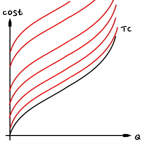
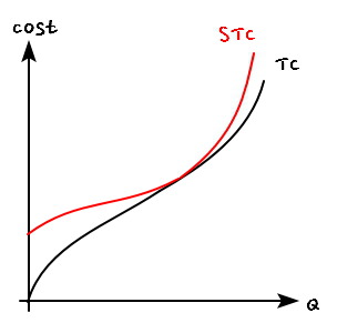
We’re going to lump long-run and short-run together.
We’ll figure out exactly how they lump together.
What we know:
TC is

like this.
And STC is

like this.
That’s literally all we know.
So if we lump them into one,
it’s gotta be one of the (many many) possible cases of that red line.
Once we lump them…
spoiler the conclusion: it ends up drawn like this.

(Since we only know the general shape, the picture’s changed a little from the figures above… well, totally. But notice the general shape is the same.)
We can convince ourselves that the two curves must be tangent at exactly one point.
The logic for nailing down that point —
it’s the expansion path.
The short-run and long-run expansion paths looked like this:

(See #34. http://gdpresent.blog.me/220759588896)

Short-run analysis [ Microeconomics I Studied #34 ]
OK now let’s wrap up the long-run analysis and dive into short-run. As mentioned right at the start…
gdpresent.blog.me
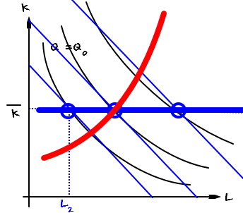
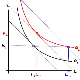
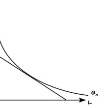
First — the expansion path is “the set of (L, K) that achieves minimum cost.”
Now let’s read this graph again!!!!

The L and K that hit minimum cost at output $Q_{1}$ — call them
$(L_{1},\quad K_{1})$.
And say short-run K is locked at $K_{1}$, and we try bumping output Q up to
$Q_{2}$, which is higher than $Q_{1}$.
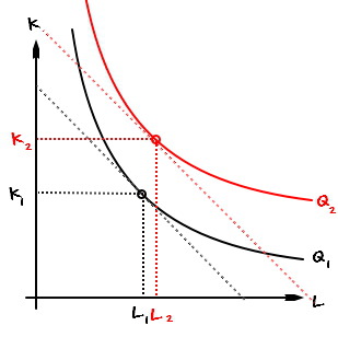
Among all the (L, K) that produce $Q_{2}$, the one that hits minimum cost is
$(L_{2},\quad K_{2})$.
But in the short run, K can’t move to $K_{2}$.
Because it’s stuck at $K_{1}$.
Meaning —
we’ve gotta produce $Q_{2}$ using $K_{1}$.

Which puts us at $(L'_{2},\quad K_{1})$,
but —
the iso-cost line passing through $(L'_{2},\quad K_{1})$
sits higher than the red iso-cost line, see?
So producing $Q_{2}$ with $K_{1}$ burns more cost than the red dotted line.
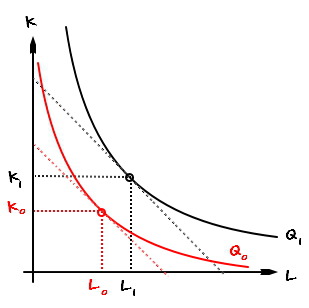
Same logic — let’s try going the other way and shrink output from $Q_{1}$ down to $Q_{0}$.

Among the (L, K) producing $Q_{0}$, the cost-minimizing one is
$(L_{0},\quad K_{0})$.
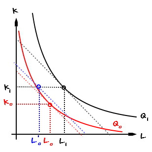
But same deal here —
in the short run K can’t drop to $K_{0}$.
It’s locked at $K_{1}$.
Meaning —
we’ve gotta produce $Q_{0}$ using $K_{1}$.
So we end up at $(L'_{0},\quad K_{1})$,
but…..
the iso-cost line through $(L'_{0},\quad K_{1});;;$
sits higher than the red iso-cost line, again.
So producing $Q_{0}$ with $K_{1}$ also burns more than the red dotted line.
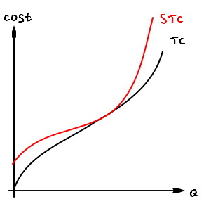
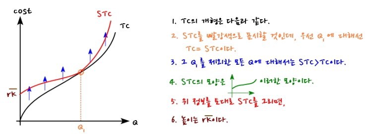
OK back to the cost curves.
Let’s stack up what we’ve got:
The long-run total cost curve (TC) —
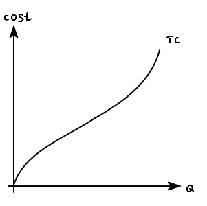
we know it looks like this.
And the general shape of the short-run total cost curve (STC) —
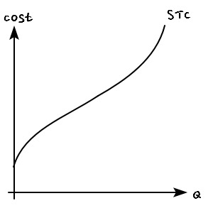
like this.
And we figured out: at one specific Q point $Q_{1}$, TC = STC. Everywhere else,
TC < STC.
Now let’s piece these facts together one by one.

Just follow the colors ^^
Make sense…? heh heh heh
OK so now let’s
dig into the slope function too.
For the long-run case —
i.e. the slope analysis with respect to TC — we already did that earlier.
(See #36. http://gdpresent.blog.me/220759772087)
Total cost, marginal cost, average cost [ Microeconomics I Studied #…]
Huh???? A cost curve??? Didn’t we do this before???? You might think so, but what we did before was iso-cost…
gdpresent.blog.me
Here we’ll zoom in on
$$\frac{STC}{Q}\quad =\quad SAC \\ \frac{d}{dQ}STC\quad =\quad SMC$$(Short-run Average and Marginal Cost).
OK then.
Let’s get the general shape of SAC and SMC first.
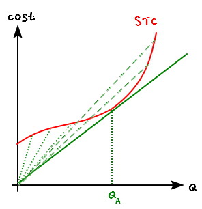
For SAC, it’s the slope from the origin to a point on STC,
and there’s clearly a Q where SAC bottoms out ‘right there’!!! Let’s call it $Q_A$.
(Oh wait?! That point’s actually the Q where STC intersects TC. (whisper whisper))
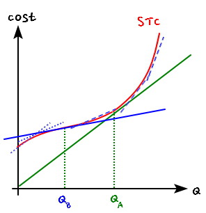
Now SMC.
Up until that solid-line slope way over there,
the slope of the tangent to STC keeps dropping. Then it starts climbing!!!!!
Let’s call the Q with the minimum SMC $Q_B$!!!!
(Oh wait!!! At $Q_A$, SMC and SAC are equal….. (whisper whisper))
With all that info,
if we toss SAC and SMC onto the same set of axes,
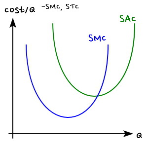
Oh wait!!!!!!!!!!!!!!!!!!
The general shape we got when deriving AC and MC from TC
and the general shape we got when deriving SAC and SMC from STC come out exaaaactly the same?!?!?!?!
OK so now for real, let’s draw AC, MC, SAC, and SMC all lumped together.
This has already gone way too long.
I’ll just jump straight into the next post and pick it up there — no more yakking.
Originally written in Korean on my Naver blog (2016-07). Translated to English for gdpark.blog.
Comments
Discussion happens via GitHub Discussions. You'll need a GitHub account to comment.