Graphing AC, MC, SAC, and SMC Together
We finally plot AC, MC, SAC, and SMC all on one graph and trace exactly how they intersect and relate as capital K gets pinned at different levels — it all snaps into place!
OK, time to actually draw AC, MC, SAC, SMC all on the same graph for real this time.
(If you haven’t read the earlier posts in this series, the logic might feel a bit scattered — please go back and catch up first ;_;!!)
(hhttp://gdpresent.blog.me/220760545755)
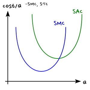
Economies of scale & diseconomies of scale [Microeconomics I Studied #39]
Up until now, we have been implicitly assuming that r and w are constant and explored TC. So this time, the factors of production…
gdpresent.blog.me
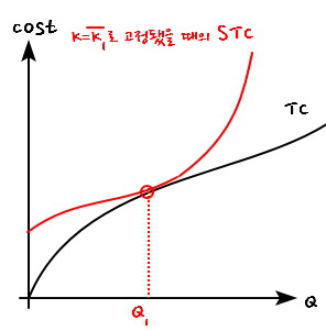
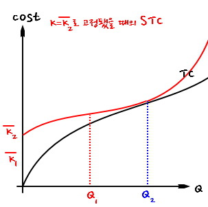
OK so. Let’s say K is pinned at $\overline{K_1}$. Then STC and TC come out looking like that.
The one point where STC and TC actually touch — call that Q_1.
And for every other point besides Q_1, AC < SAC.
(In your head, just compare slopes drawn from the origin out to each curve — you’ll see AC < SAC has to hold. SAC sits higher up there, so there’s literally no other way around it.)
Now let’s also compare MC — the slope of the tangent to TC —
against SMC, the slope of the tangent to STC.

Up to Q_1, SMC < MC.
After Q_1, SMC > MC.
On top of that,
and on top of this,
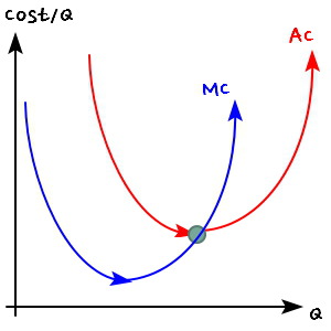
let’s draw AC, MC, SAC, SMC all on the same graph!!!!!!
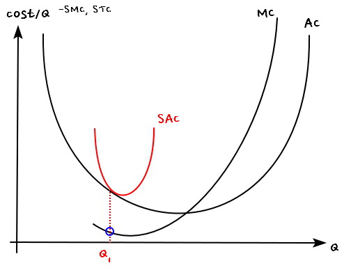
So first I drew the graph above based on the fact that AC and SAC meet at some Q_1, and SAC > AC at every other point.
And at that same Q_1, we said MC = SMC.
So whether we realize it or not, MC has to pass straight through that blue dot heh heh heh.
Oh — and before Q_1, SMC < MC, and after Q_1, SMC > MC~~~.
Wait, but SMC also has to pass through the extremum of SAC,
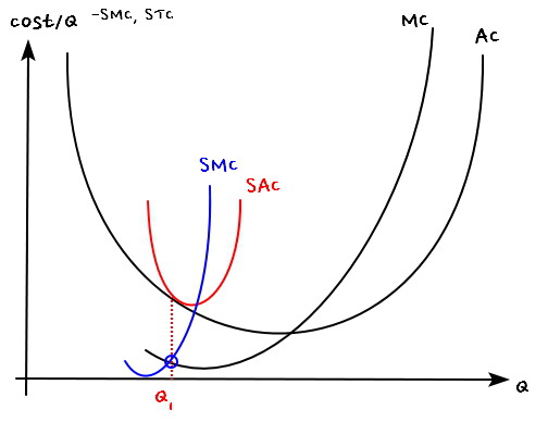
and end up shaped like this — we just covered that a bit ago.
So SMC in the big combined graph above should be drawn like this.

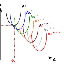
OK now let’s think about K being pinned at $\overline{K_2}$ — a bit higher than $\overline{K_1}$.

TC doesn’t change at all from before.
But STC shifts up a bit compared to before.
Even with that shift, there’s still some characteristic Q — call it Q_2, a value a bit bigger than the earlier Q_1.
I marked it in blue on the graph above.
Now take all the characteristics we had at the earlier Q_1 and just transfer them over to Q_2.
Draw the new SAC and SMC,
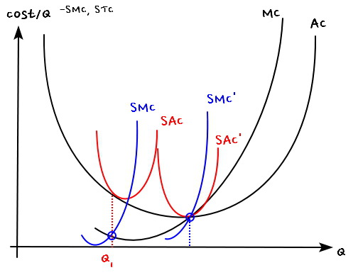
stack them onto what we already have,
and you get this.
OK, finally —
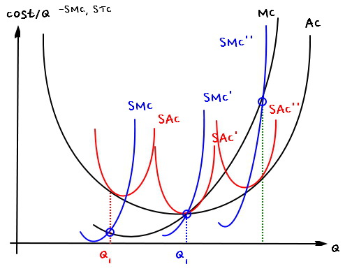
let’s say K is pinned at $\overline{K_3}$, bigger still than $\overline{K_2}$.
Then
the red line slides up even further,
the “characteristic Q value” shifts to an even bigger Q,

and moving that new characteristic Q further to the right,
then drawing it on the graph above with all the same characteristics carried over,

drawn correctly, right???
SMC’’ is smaller than MC before the characteristic Q,
bigger than MC after,
and it passes through the extremum of SAC’',
oh, and only at that characteristic Q do AC and SAC match in value,
and at every other point, SAC > AC.
Everything drawn correctly heh heh heh heh.
Originally written in Korean on my Naver blog (2016-07). Translated to English for gdpark.blog.
Comments
Discussion happens via GitHub Discussions. You'll need a GitHub account to comment.