Derivation of the Student's t-Distribution
Where the 'Student' name came from, why we ditch the Z-stat when σ is unknown, and a full derivation of the t-distribution PDF — plus properties and a worked example.
First off, the name. Why “Student t-distribution”?
Turns out W.S. Gosset was working at a brewery, and he stumbled onto this distribution while doing brewery stats. Cool. But — he didn’t want other breweries getting their hands on it, so he published under the pen name “Student.” That’s the whole story. Student t-distribution.
OK so why do we even use this thing?
Say we want to estimate the population mean $\mu$. The natural move is to use the sample mean

and look at the distribution of

which gives us
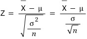
Cool, that’s the Z statistic. Use it, done.
EXCEPT — what if

is unknown? Then the Z statistic is dead in the water. Can’t use it.
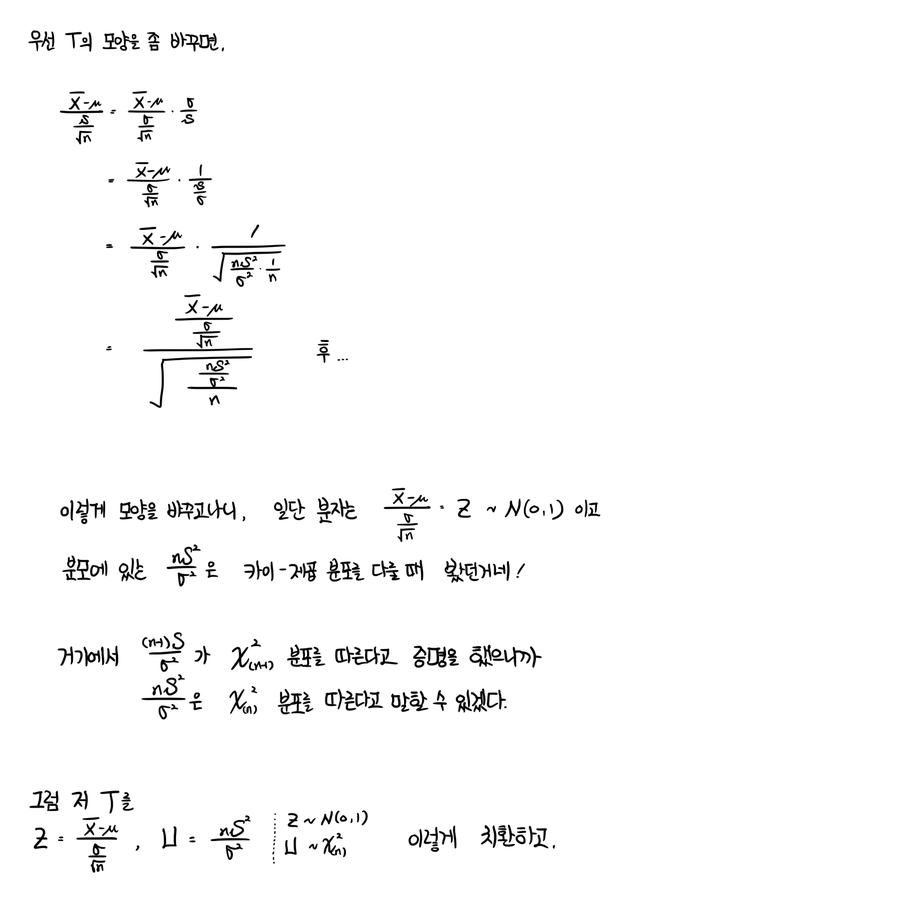
So as the backup plan, we use

which we call the T statistic. And the distribution this guy follows is — surprise — the t-distribution.
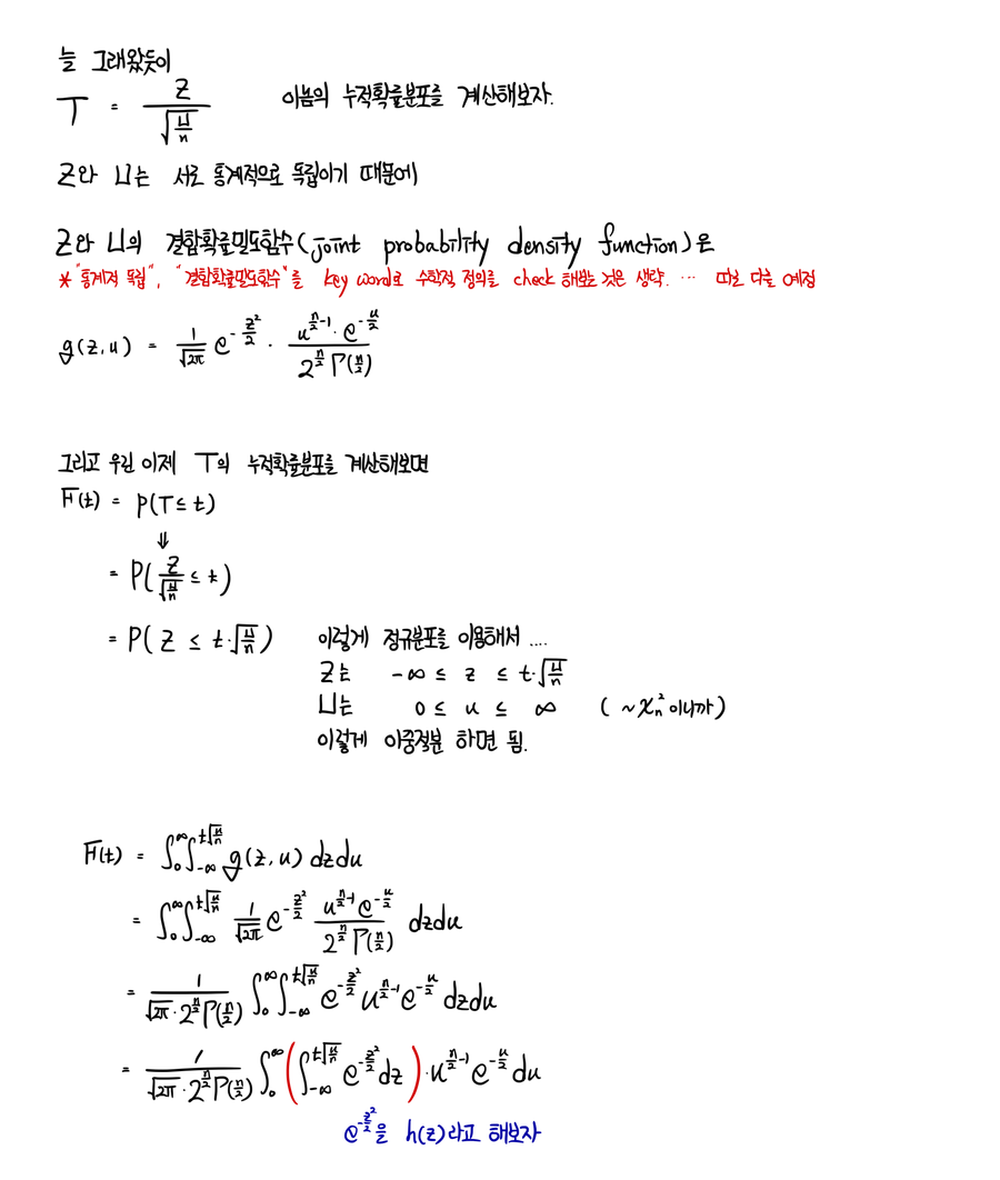
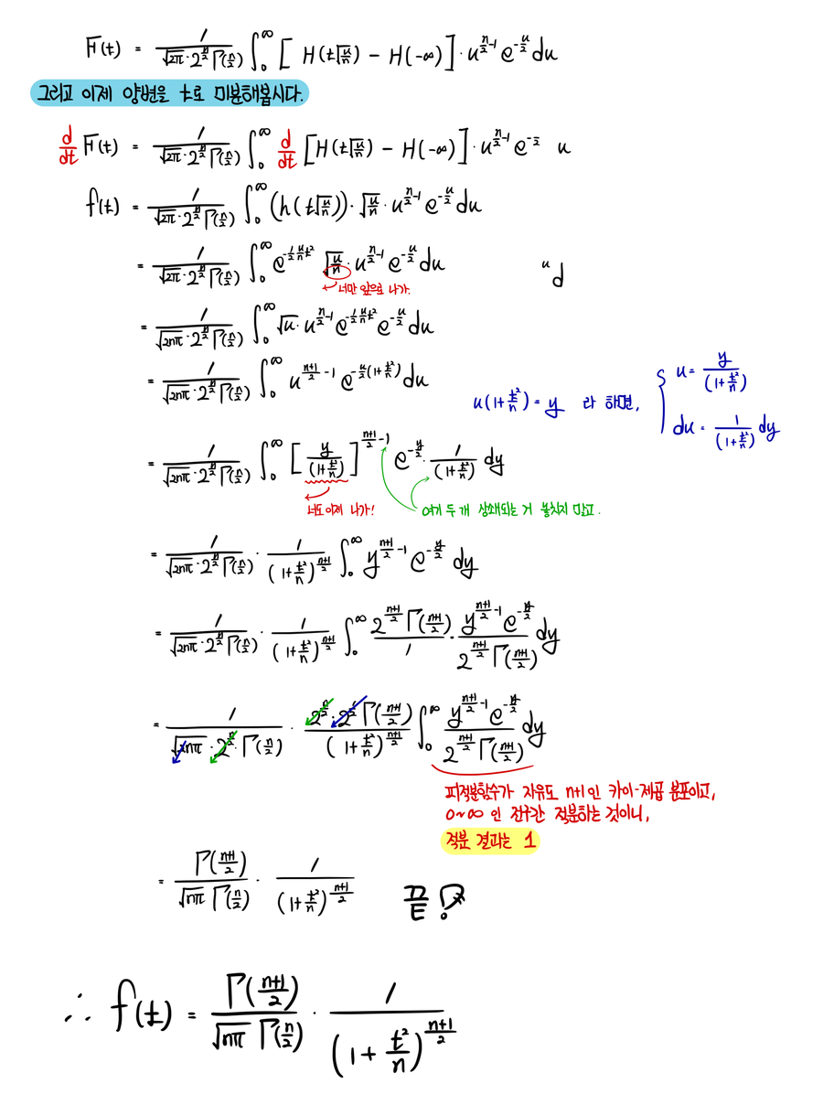
The PDF of the t-distribution looks like:
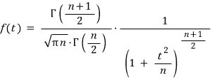
…and that’s what the textbook says.
But we’re not just gonna stare at it and move on, right???? Right????
I mean — this whole post is basically the derivation anyway lol lol lol lol heh heh.
Let’s go.
OK now let’s quickly hit the properties of the t-distribution and wrap this up.
First — the t-distribution is symmetric about the origin. (You can see it’s an even function with basically no effort.)
Second — most stats people will tell you that if your sample size is “less than 30,” you should use the t-distribution. (Some say 100. Some say 10. Splitting the difference at 30 is the rough consensus, so just go with that.)
Mean and variance:
- Mean: $E(T) = 0$, for $n > 1$. (Translation: the t-distribution with 1 degree of freedom has no mean.)
- Variance: $\mathrm{Var}(T) = n/(n-2)$, for $n > 2$. (Translation: t-distributions with 1 or 2 degrees of freedom have no variance!!!!)
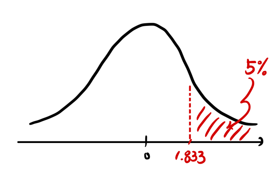
OK and finally — how to read the t-distribution table. (Honestly might not even be necessary, but,,,)
The table gives you the $(1-\alpha)$ quantile written as

which means
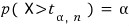
So for example, when you look at the table:
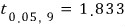
What’s that number telling you?!
Hmm….. let’s just do one example and call it a day.
(Problem from: Walpole, et al., Probability and Statistics for Engineers and Scientists.)
Ex. 8.11 A chemical engineer claims that the yield of a certain batch process is 500g per liter of raw material. To prove it, every month he pulls 25 batches and runs tests. The rule: if the t-value computed from the test results lands between $-t_{0.05}$ and $t_{0.05}$, his claim stands. The 25-batch test came back with a sample mean of 518 and a standard deviation of 40g. What can we say? Assume the population is approximately normal.
Plug into the t formula:
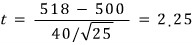
With 24 degrees of freedom, $t_{0.05} = 1.711$. Our computed t value is bigger than $t_{0.05}$ — so we can say the actual yield is greater than 500g.
Now in real life, the t-distribution gets used a ton in t-tests — but we haven’t actually talked about hypothesis testing here yet, so it’d feel kinda wrong to drop a t-test problem on you. We’ll come back to testing later and do one then.
n = [1., 2., 5., 100000000000000]
for i in n:                   # i = n
    x = np.linspace(-5, 5, 100)
    y = sc.t(i).pdf(x)
    plt.plot(x, y, linewidth=2.0, label = 'n=%s' % i)
plt.grid(True)
plt.legend()
plt.ylabel('p(x)')
plt.xlabel('x')
plt.title('Student-t Distribution')
# plt.savefig('5.Student-t Distribution.jpeg')
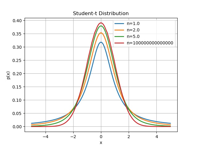
Apparently, as $n$ keeps cranking up, this thing converges to the Gaussian.
Shall we verify that with a computer?!??!
n = 5.
x = np.linspace(-0.3, 0.3, 100)
for i in range(3):
    y1 = sc.t(n).pdf(x)
    plt.plot(x, y1, linewidth=2.0, label = 'n=%s' % n)
    n = n * 5
y2 = sc.norm(0, 1).pdf(x)
plt.plot(x, y2, linewidth=1.0, label = 'Gaussian')
plt.grid(True)
plt.legend()
plt.ylabel('p(x)')
plt.xlabel('x')
plt.ylim(0.37, 0.4)
plt.title('Student-t & Gaussian Distribution')
# plt.savefig('6.Student-t & Gaussian Distribution.jpeg')
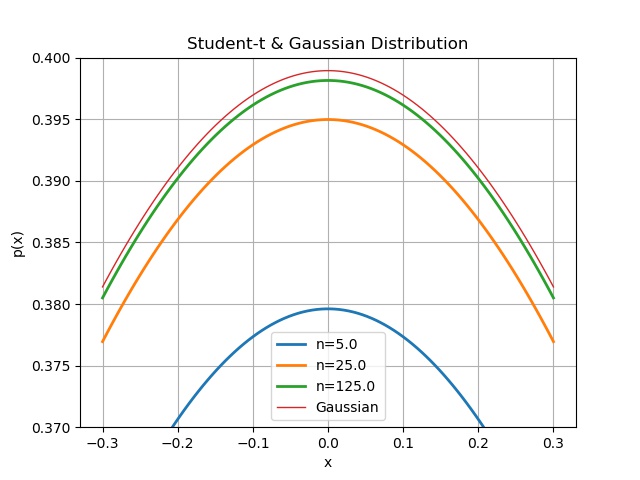
After plotting it a few times, it really did look like the center was aggressively catching up to the Gaussian, so I zoomed the y-range way in to focus on it.
With the range pinned down like that, let’s crank $n$ up bigger and bigger again.
n = 50.
x = np.linspace(-0.3, 0.3, 100)
for i in range(3):
    y1 = sc.t(n).pdf(x)
    plt.plot(x, y1, linewidth=2.0, label = 'n=%s' % n)
    n = n * 5
y2 = sc.norm(0, 1).pdf(x)
plt.plot(x, y2, linewidth=1.0, label = 'Gaussian')
plt.grid(True)
plt.legend()
plt.ylabel('p(x)')
plt.xlabel('x')
plt.ylim(0.37, 0.4)
plt.title('Student-t & Gaussian Distribution(2)')
# plt.savefig('7.Student-t & Gaussian Distribution(2).jpeg')
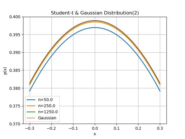
Once $n$ gets stupidly large, the curves just completely overlap to the eye — so I picked a “big enough” $n$ at a sensible point and stopped……
Originally written in Korean on my Naver blog (2017-11). Translated to English for gdpark.blog.
Comments
Discussion happens via GitHub Discussions. You'll need a GitHub account to comment.